Expand my Community achievements bar.

Guidelines for the Responsible Use of Generative AI in the Experience Cloud Community.

Responsive Layout for Site

Avatar

Level 1

Hi All,


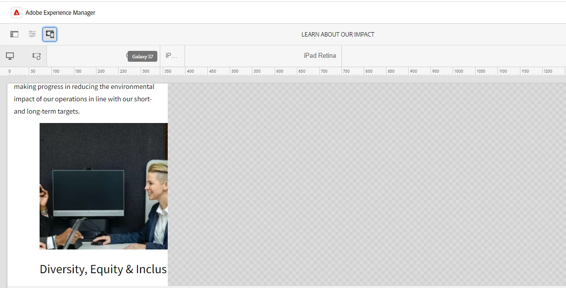
      I have created a static site using standard AEM Site Template 2.2.0. It is working fine in desktop view but when change it to other views it's UI not responsive.

I tried with this methods: Understanding Responsive Layout with AEM Sites | Adobe Experience Manager

Responsive layout for your content pages | Adobe Experience Manager

How can we make a site responsive in all device views?.
Elizabeth_0-1703851535559.png


3 Replies

Avatar

Level 3

@Elizabeth  can you please share more details on which exact components authored? Sounds like you added RTE, placed an image inside RTE and expecting image inside RTE to be responsive. This is NOT ootb. 

You can read similar issue discussed here. https://stackoverflow.com/questions/42629863/aem-page-with-rich-text-and-image

Basically split your content into 2 components: RTE + Image component below. That will be responsive. 


Most components are responsive unless you try some variations. Should split content accordingly. Or pick correct component for usecase. Refer to component library here https://www.aemcomponents.dev/

Last option, should consider creating custom components to cater requirement. 


Avatar

Level 1

Hi @saravana_sgws,

    I am working in AEM as a cloud service and used the teaser(v2) component and the Text(v2) component, but the layout is not coming properly in the Galaxy S7 view and iPhone 8 Plus view. 

Can you please suggest any document or idea regarding responsive layout in sites. 

Avatar

Administrator

@Elizabeth Did you find the suggestions from users helpful? Please let us know if more information is required. Otherwise, please mark the answer as correct for posterity. If you have found out solution yourself, please share it with the community.


Kautuk Sahni