Hi Team,
There are many issues with the layout.
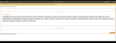
On the template level, there's an overflow of the containers on the right

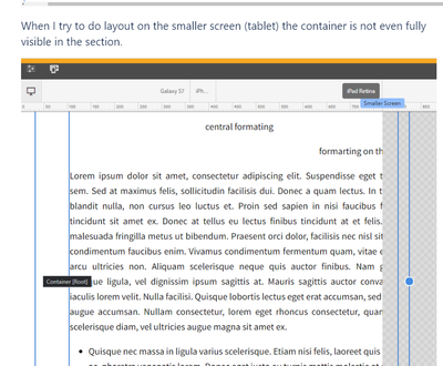
When I try to do layout on the smaller screen (tablet) the container is not even fully visible in the section.


Grid.less file having this code
/*
 *  Copyright 2018 Adobe Systems Incorporated
 *
 *  Licensed under the Apache License, Version 2.0 (the "License");
 *  you may not use this file except in compliance with the License.
 *  You may obtain a copy of the License at
 *
 *      http://www.apache.org/licenses/LICENSE-2.0
 *
 *  Unless required by applicable law or agreed to in writing, software
 *  distributed under the License is distributed on an "AS IS" BASIS,
 *  WITHOUT WARRANTIES OR CONDITIONS OF ANY KIND, either express or implied.
 *  See the License for the specific language governing permissions and
 *  limitations under the License.
 */

@import (once) "/libs/wcm/foundation/clientlibs/grid/grid_base.less";

/* maximum amount of grid cells to be provided */
@max_col: 12;

/* default breakpoint */
.aem-Grid {
  .generate-grid(default, @max_col);
}

/* phone breakpoint */
@media (max-width: 768px) {
  .aem-Grid {
    .generate-grid(phone, @max_col);
  }
}

/* tablet breakpoint */
@media (min-width: 769px) and (max-width: 1200px) {
  .aem-Grid {
    .generate-grid(tablet, @max_col);
  }
}

/* force showing hidden components in unhide mode */
.aem-GridShowHidden > .cmp-container > .aem-Grid > .aem-GridColumn {
  display: block !important;
}
Can anyone help me.