Expand my Community achievements bar.

SOLVED

Is there a granite component for a key value?

Avatar

Level 5

Hi guys,


I'm looking to add a key value to a cq dialog.


I can use granite/ui/components/coral/foundation/form/multifield combined with granite/ui/components/coral/foundation/form/textfield to get a list, but what about a map?


I.e. I need users to be able to specify keys and corresponding value?


Thanks!

1 Accepted Solution

Avatar

Correct answer by
Community Advisor

@jkpanera ,

Your requirement to allow authors to insert custom Key Pair Values from the Granite UI dialogue is possible. Simply use the Multifield and two, child text-field Granite UI components for your dialogue configuration.

An example of a configured dialogue would look something like this:
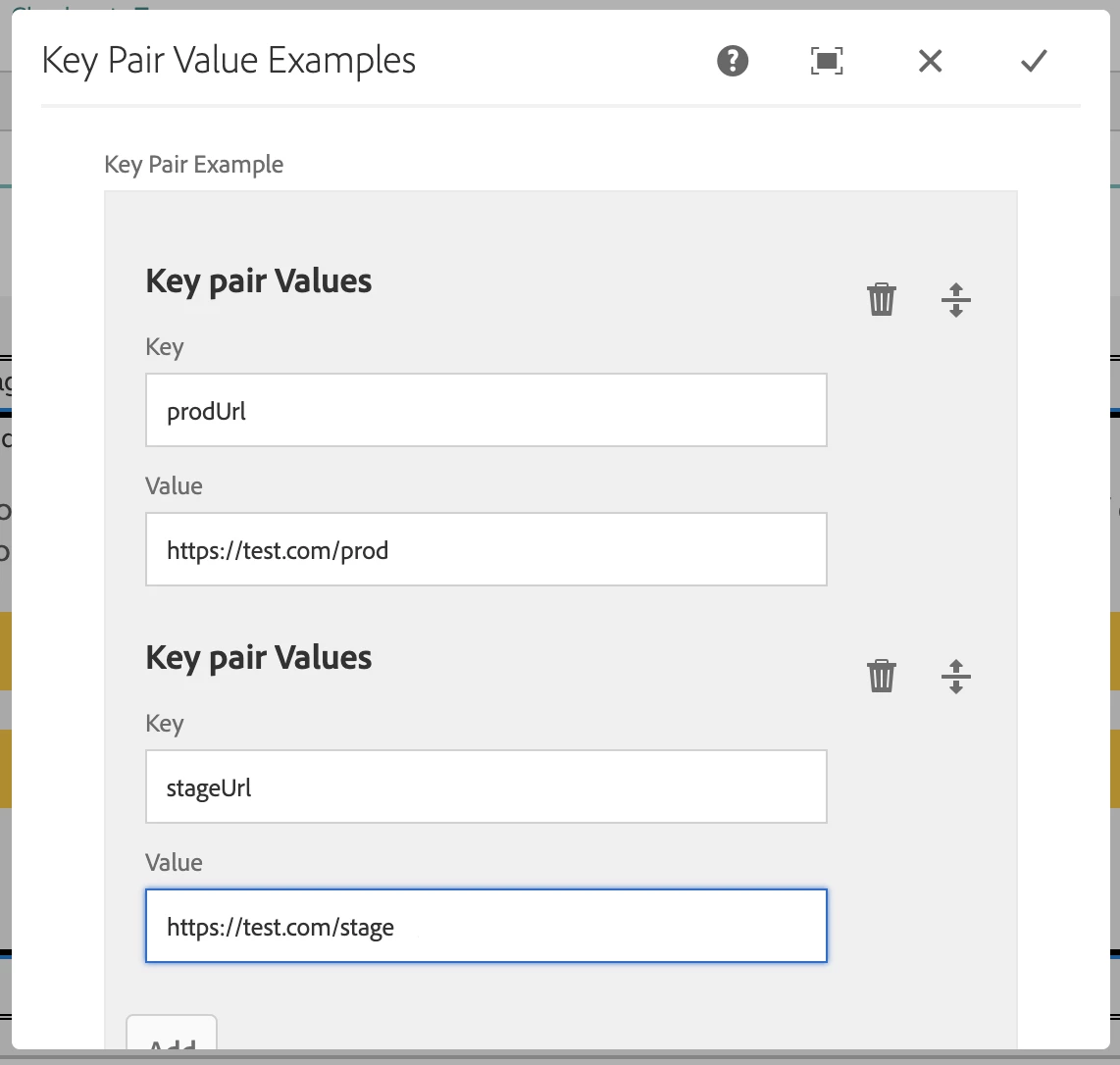
example-dialog.png

Here's how the Granite UI configuration XML example:


<keypairvalue
    jcr:primaryType="nt:unstructured"
    sling:resourceType="granite/ui/components/coral/foundation/form/multifield"
    composite="{Boolean}true"
    fieldLabel="Key Pair Example">
    <field
        jcr:primaryType="nt:unstructured"
        sling:resourceType="granite/ui/components/coral/foundation/container"
        name="./keypairvalue">
        <items jcr:primaryType="nt:unstructured">
            <fieldset
                jcr:primaryType="nt:unstructured"
                jcr:title="Key pair Values"
                sling:resourceType="granite/ui/components/coral/foundation/form/fieldset">
                <items jcr:primaryType="nt:unstructured">
                    <key
                        jcr:primaryType="nt:unstructured"
                        sling:resourceType="granite/ui/components/coral/foundation/form/textfield"
                        fieldLabel="Key"
                        name="./key"/>
                    <value
                        jcr:primaryType="nt:unstructured"
                        sling:resourceType="granite/ui/components/coral/foundation/form/textfield"
                        fieldLabel="Value"
                        name="./value"/>
                </items>
            </fieldset>
        </items>
    </field>
</keypairvalue>


After the component have been configured and saved, your JCR node structure should be organised as so:

saved-output.png

saved-output-2.png

Now your content should be structured and can be easily extracted by your AEM backend bundles.

I hope this helps,

Brian.

View solution in original post

1 Reply

Avatar

Correct answer by
Community Advisor

@jkpanera ,

Your requirement to allow authors to insert custom Key Pair Values from the Granite UI dialogue is possible. Simply use the Multifield and two, child text-field Granite UI components for your dialogue configuration.

An example of a configured dialogue would look something like this:

example-dialog.png

Here's how the Granite UI configuration XML example:


<keypairvalue
    jcr:primaryType="nt:unstructured"
    sling:resourceType="granite/ui/components/coral/foundation/form/multifield"
    composite="{Boolean}true"
    fieldLabel="Key Pair Example">
    <field
        jcr:primaryType="nt:unstructured"
        sling:resourceType="granite/ui/components/coral/foundation/container"
        name="./keypairvalue">
        <items jcr:primaryType="nt:unstructured">
            <fieldset
                jcr:primaryType="nt:unstructured"
                jcr:title="Key pair Values"
                sling:resourceType="granite/ui/components/coral/foundation/form/fieldset">
                <items jcr:primaryType="nt:unstructured">
                    <key
                        jcr:primaryType="nt:unstructured"
                        sling:resourceType="granite/ui/components/coral/foundation/form/textfield"
                        fieldLabel="Key"
                        name="./key"/>
                    <value
                        jcr:primaryType="nt:unstructured"
                        sling:resourceType="granite/ui/components/coral/foundation/form/textfield"
                        fieldLabel="Value"
                        name="./value"/>
                </items>
            </fieldset>
        </items>
    </field>
</keypairvalue>


After the component have been configured and saved, your JCR node structure should be organised as so:

saved-output.png

saved-output-2.png

Now your content should be structured and can be easily extracted by your AEM backend bundles.

I hope this helps,

Brian.