Use case:
Add two text size fields instead of one for the Text and Title components so that text size can be configured differently on mobile and desktop.
Solution options:
| Solution options | constraints/limitations |
|---|
solution 1: style="font-size:${properties.fontSize @ context='styleToken'}px; font-size-mobile:${properties.fontSizeMobile @ context='styleToken'}px | browser not recognizefont-size-mobileclass |
solution 2:style="font-size:${properties.fontSizeMobile @ context='styleToken' || properties.fontSize @ context='styleToken'}px | syntax error |
| |
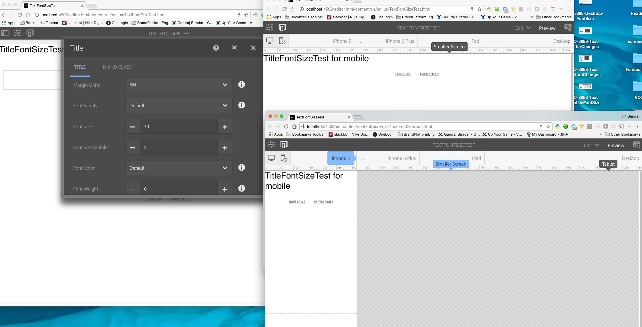
Screenshot of solution1 :
font-size-mobilenot recognized by browser
ASK?
What's the valid slightly code to support above use case?
CODE:
/text/_cq_dialog/.content.xml:
<fontSize
jcr:primaryType="nt:unstructured"
sling:resourceType="granite/ui/components/foundation/form/numberfield"
fieldLabel="Font Size"
name="./fontSize"
min="12"
max="120"
defaultValue="18">
</fontSize>
<fontSizeMobile
jcr:primaryType="nt:unstructured"
sling:resourceType="granite/ui/components/foundation/form/numberfield"
fieldLabel="Font Size Mobile"
name="./fontSizeMobile"
min="1"
max="100"
defaultValue="0">
</fontSizeMobile>
Text.html:
<sly data-sly-test="${!wcmmode.edit}">
<div class="txt-desktop ${text.cssClass} ${properties.fontFamily} nsg-text--${properties.nsgColorFont}${properties.authorInputClass ? ' ' : ''}${properties.authorInputClass}" id="${properties.authorInputID || ''}" data-emptytext="Text" style="font-size:${properties.fontSize @ context='styleToken'}px;font-weight:${properties.fontWeight @ context='styleToken'};line-height:${properties.lineHeight || '2' @ context='styleToken'}; padding: ${properties.marginTop || '0' @ context='styleToken'}${properties.marginUnits || 'em' @ context='styleToken'} ${properties.marginRight || '0' @ context='styleToken'}${properties.marginUnits || 'em' @ context='styleToken'} ${properties.marginBottom || '1' @ context='styleToken'}${properties.marginUnits || 'em' @ context='styleToken'} ${properties.marginLeft || '0' @ context='styleToken'}${properties.marginUnits || 'em' @ context='styleToken'}; ">
<p data-sly-use.text="text.js" data-sly-unwrap="${text.context == text.CONST.CONTEXT_HTML}" data-emptytext="Text">${text.text @ context=text.context}</p>
</div>
<div class="txt-mobile ${text.cssClass} ${properties.fontFamily} nsg-text--${properties.nsgColorFont}" data-emptytext="Text" style="font-size:${properties.fontSize @ context='styleToken'}px;font-size-mobile:${properties.fontSizeMobile @ context='styleToken'}px;font-weight:${properties.fontWeight @ context='styleToken'};line-height:${properties.lineHeight || '2' @ context='styleToken'}; padding: ${properties.mmarginTop || '0' @ context='styleToken'}${properties.marginUnits || 'em' @ context='styleToken'} ${properties.mmarginRight || '0' @ context='styleToken'}${properties.marginUnits || 'em' @ context='styleToken'} ${properties.mmarginBottom || '1' @ context='styleToken'}${properties.marginUnits || 'em' @ context='styleToken'} ${properties.mmarginLeft || '0' @ context='styleToken'}${properties.marginUnits || 'em' @ context='styleToken'}; ">
<p data-sly-use.text="text.js" data-sly-unwrap="${text.context == text.CONST.CONTEXT_HTML}" data-emptytext="Text">${text.text @ context=text.context}</p>
</div>
</sly>