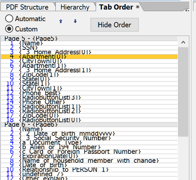
I've been using LiveCycle/AEM Forms for a number of years, but at some point (maybe when my company made the switch to Windows 10, I'm not exactly sure) the Tab Order palette has become extremely cramped and hard to read. It looks like a row in Excel that hasn't been expanded to display everything written.
I haven't been able to find any way to correct this. I have to squint and struggle through ever document when it's time to adjust tab order. Does anyone else experience this, or know how to fix it?
