Hi
I created a survey in Adobe Campaign and I am having trouble with the mobile rendering -> need it Mobile Responsive.
I tried below piece of code (shared in this forum for the similar issue) in my custom CSS but still no luck:
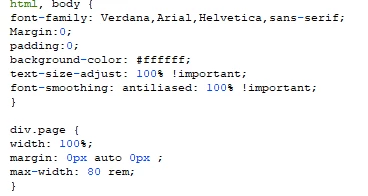
Please suggest what else I should add in my custom CSS to make it responsive on mobile?
Thanks,
Anita
Hi,
Add this tag to <head/>:
<meta name="viewport" content="width=device-width, initial-scale=1.0">
You'll probably want some @media conditional blocks in the css too, depending on what the content's supposed to look like at different res. What is div.page?
Thanks,
-Jon
Thanks Jon for your response.
I have added the code you have shared but that also did not really help .
Here is the "div.page" :
Please let me know what should I add here?
Thanks,
Anita
Views
Replies
Total Likes
Mobile responsiveness doesn't rely only on the root node width. If you have specified width inside the root node/ if width is specified in any child node, that needs to be updated to 100% in media query.
eg:
@media(maxwidth:1200px) and (min-width:320px) {
.yourClassname1,
.yourClassname2 {
width:100%;
}
}
Thank You somasundaramhaldurai .
I have already tried media query for some std screen sizes. But somehow the rendering is not consistent.
I will try modifying the code in CSS and see if it works.
Regards,
Anita
Views
Replies
Total Likes
Share the URL if you don't mind. Will figure out and fix
Hi somasundaramhaldurai .
Thank you . I won't be able to share the URL but i will reach out if I still face any issues with the CSS.
Appreciate your help.
-Anita
Views
Replies
Total Likes
Views
Likes
Replies
Views
Likes
Replies
Views
Likes
Replies