It sounds like maybe you selected one of the rows/columns/cells in your freeform table.
The Visualizations actually will update to reflect selections (unless you lock them to a specific set of data).
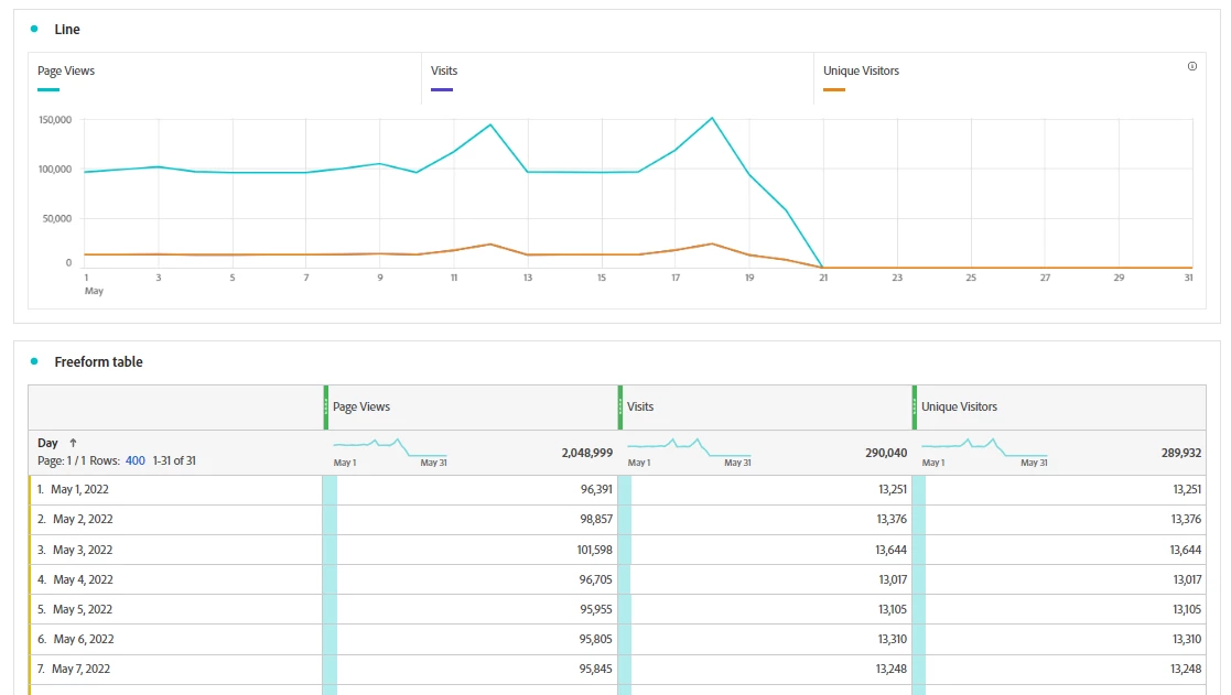
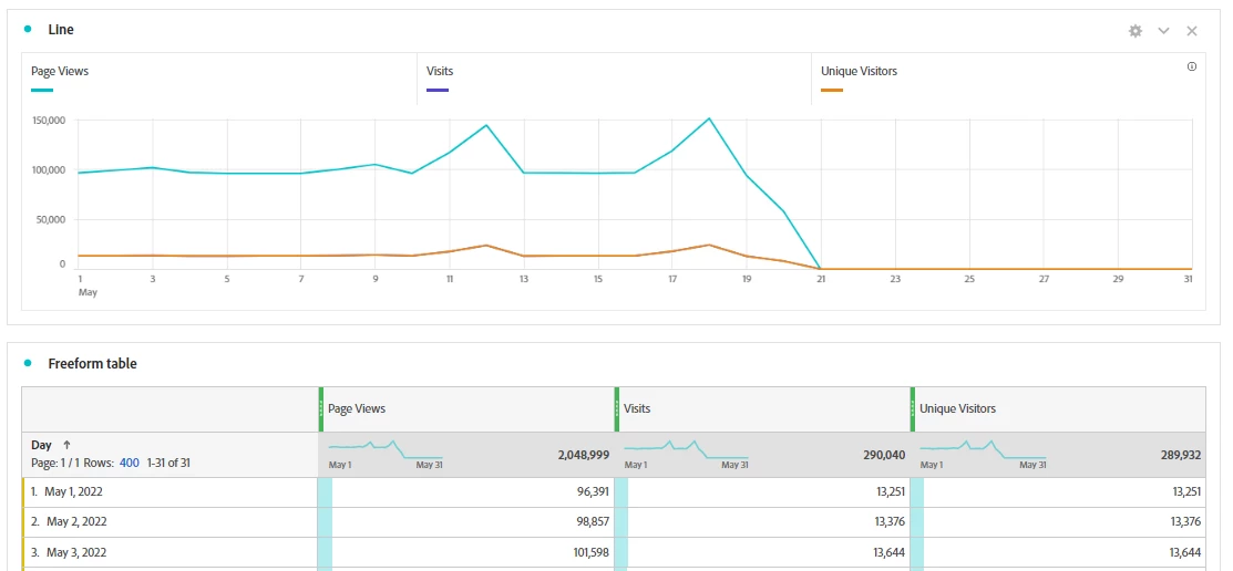
For example, here is the initial set up of something like you described:
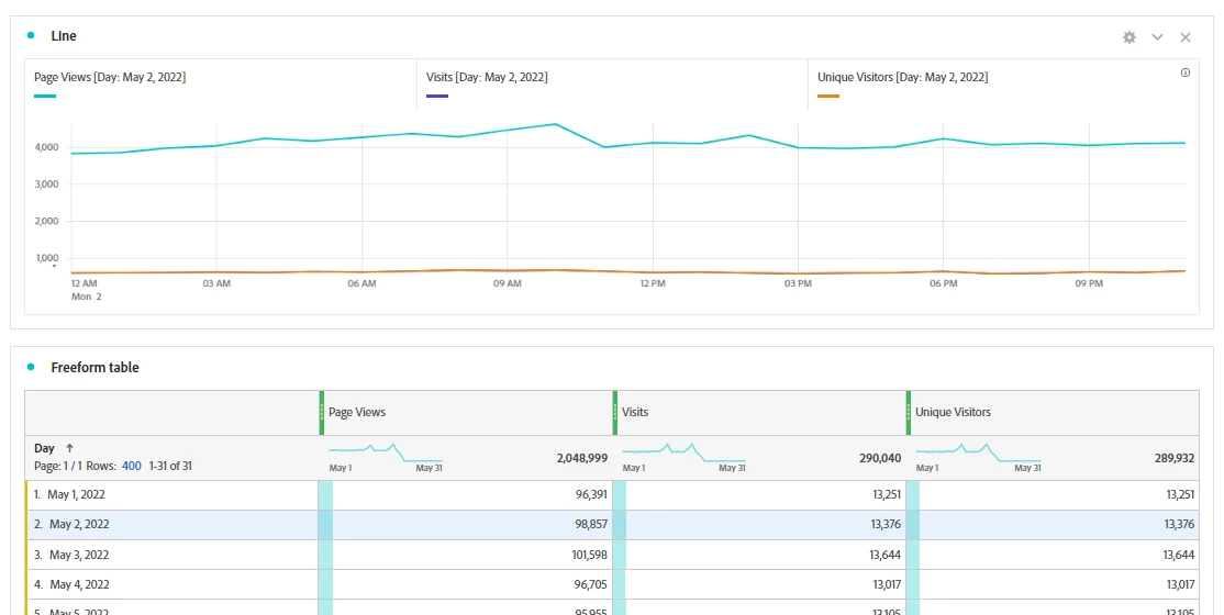
And then you start seeing something like this:
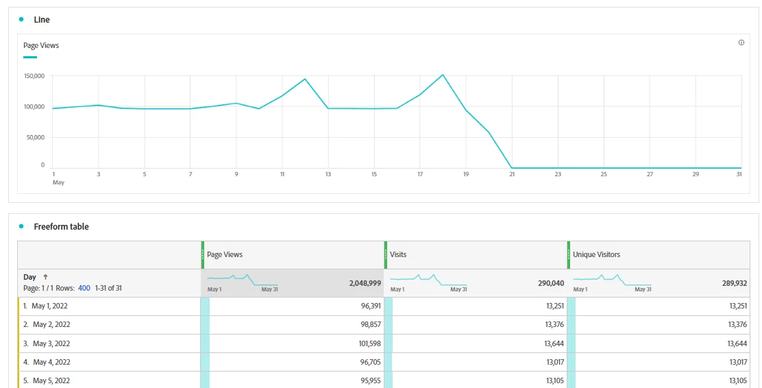
or this
Or even this:
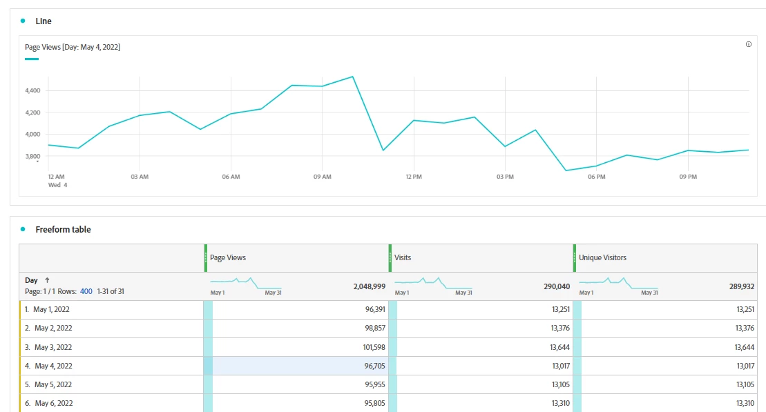
Notice that in each of these instances, I have a row, column or cell selected that is changing what the line graph is showing:
- May 2 (blue highlight), meaning my line graph was now restricted to May 2 (this makes the timeline now hourly for that day)
- In the second I clicked on the total PVs column (darker grey highlight) meaning that my line graph was just PVs for the entire time frame
- The third, I actually clicked on the PVs for May 4th (blue highlight) so the data is now showing me PVs for just May 4th
You can fix this "simply" by de-selecting the cell you clicked on (click on it again). Or you can prevent this from happening by locking the line graph. For this scenario, I am going to multi-select all the columns of data (which will actually look just like the default behavior)
Now, I will click on the blue dot next to the Line Graph Title to pull up a context menu:
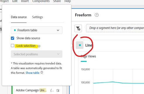
And I am going to check the "Lock Selection" option. This will lock the line graph to my current selection, and no matter if I deselect, or select something new, the line graph will now no longer change. You will also notice that the dot becomes a lock icon.
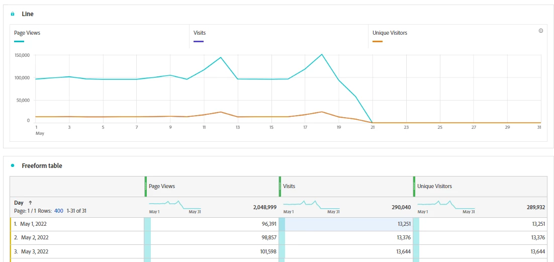
You can see that I have May 1st Visits now selected, but my line graph hasn't changed to reflect the selection.
Note: You must have something selected before "Lock Selection" becomes an option, and you can change it to be "Selected Positions", or "Selected Items" depending on what you are trying to do. This works on most (if not all) graphing visualizations.