Green Bars in Adobe Analytics Workspace Tables

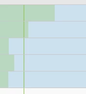
In data tables in Workspace (in those showing trends over time), green lines are visible (s. above). What do they mean?

In data tables in Workspace (in those showing trends over time), green lines are visible (s. above). What do they mean?
Hi There,
Thank you for your query.
As stated above by other community members. If you un-check background it will turn off the horizontal chart bars and if you un-check "Anomalies" then the vertical line would be gone.
Anomalies are basically the unexpected events in a period of time. e.g. a sudden rise or fall in a metric.
Thanks!
Enter your E-mail address. We'll send you an e-mail with instructions to reset your password.