Expand my Community achievements bar.

Check out the November edition of the Analytics Community Lens newsletter to see what's been trending in the last two months!
SOLVED

Greater than 400 data points on scatter plot in workspace

Avatar

Level 1

Hi All,


Looking to know if there is a way in workspace to produce a scatter with greater than 400 data points (x,y only).


Also if anyone knows if there is a way to visualise a linear trend line on a scatter plot in workspace that would be cool too.


Thanks in advance!

1 Accepted Solution

Avatar

Correct answer by
Community Advisor

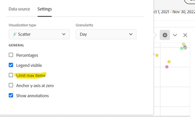
I believe the max you can get is 400 (by removing the limit on the visualization), since that is the limit for the Freeform table driving the Scatter Chart
 

Jennifer_Dungan_0-1668742616743.png


I think if you want more than that, you may have to use Report Builder to bring the data into Excel and create your visualization there.


I don't think trend lines are available on Scatter Charts. This might be worthy of posting as an Idea for people to upvote?


View solution in original post

1 Reply

Avatar

Correct answer by
Community Advisor

I believe the max you can get is 400 (by removing the limit on the visualization), since that is the limit for the Freeform table driving the Scatter Chart


Jennifer_Dungan_0-1668742616743.png


I think if you want more than that, you may have to use Report Builder to bring the data into Excel and create your visualization there.


I don't think trend lines are available on Scatter Charts. This might be worthy of posting as an Idea for people to upvote?