Please remember to hit the LIKE button to vote for this idea!
Description - When the Key Metric Summary was first introduced, it originally displayed the metrics with the number larger, ON TOP, larger, with the percentage smaller, and ON BOTTOM, like this:

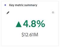
Now that some significant changes have been made (sometime after the new year), and the feature has finally been repaired (after work I just completed with Customer Care), the formatting has also been changed so that the percentage permanantly displays OVER the number, with no ability for us to swap their positions. This is frustrating, because it used to display just the opposite, and we have no abilty to change how it's displayed.
Consequently, I am proposing the following:
Not only should we have choice whether to emphasize the percentage or the number, but we should ALSO have the option to decide which number displays on top, which means the display should be dynamic, based upon the user's choice.
Why is this feature important to you - Data storytelling remains important, and the way numbers and other elements appear in a certain manner is relevant to the flow of anyone's Workspace. What may feel nitpicky to one will feel huge to another, and this was a big change!
How would you like the feature to work - Adobe is already fairly close by providing us the choice to "Emphasize the number" vs. "Emphasize percent change." All they need to do is then add the option to say, "Show emphasized item on top," OR they could simply bypass that option and simply place the emphasized item on top automatically.

Current Behaviour -
Currently, the emphasized number or percent change displays larger, but they remain in place, which is not ideal.

