Introduce visualization (or extend existing) for time between events
Description -
In digital analytics, analyzing how long it takes users to complete an action, go through a funnel, or place a purchase is essential. Many optimization efforts focus on time-to-completion and many implementations try to make it accessible through frontend code.
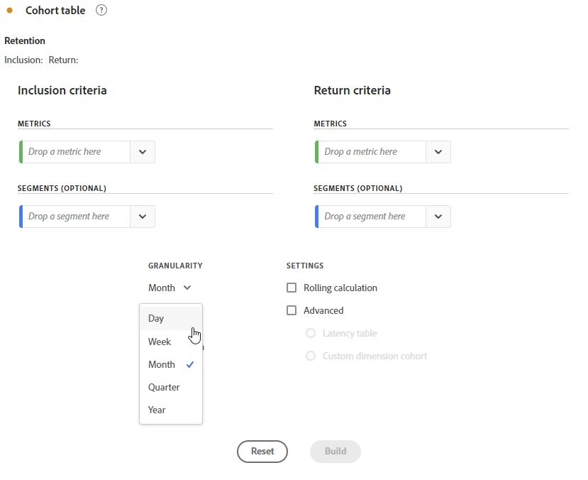
In Adobe Analytics, we can use the Cohort Table visualization to get a first idea of this. However, the smallest granularity is "day" and the resulting table is not very friendly to exploration:
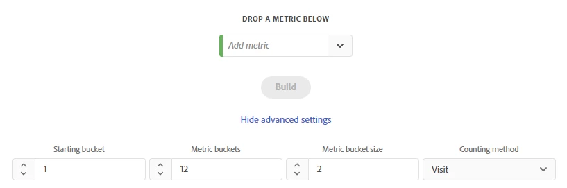
One of my personal favorite visualizations is the Histogram because it really helps during exploration, as it clearly shows in which bucket users fall and where to look next. Also, we can re-purpose the resulting Segments through showing the table:
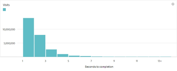
With this, I want to propose a combined visualization. Ideally, it would allow us to create a Histogram-style diagram from an input similar to the Cohort table. We would be able to select a "start event" and an "end event" (bonus points if we can select the first/last/every instance in a Sequence, Visit, or Visitor) and the granularity (from seconds to months) and bucket config, similar to the Histogram. Under the hood, again similar to the current Histogram, it would create Sequential Segments with "within" and "after" conditions and some clear names. The result can look something like this, showing a mock of seconds-to-completion of a checkout step: