Add a Divider visualisation in Workspace
There is no good way for combining various visualisations in a grid layout. Consider the following example:
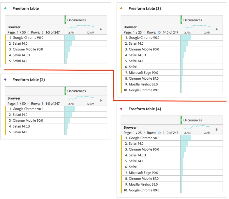
There are two workarounds that are not ideal:
1. Resize the visualisation to align them on height. The issue with this approach is that when the project gets viewed on the screens that are narrower that the screen the author used, the visualisations may get displayed with the vertical scroll bar. This happens when the columns are set up with wrapping and the narrow screens make the column name to be displayed in more lines. This often happens with metrics that names are relatively long.
2. Add any visualisation in a collapsed mode as a divider. The issue with this approach is that the visualisation has to be name, it does not look good and the users may tend to expand it.
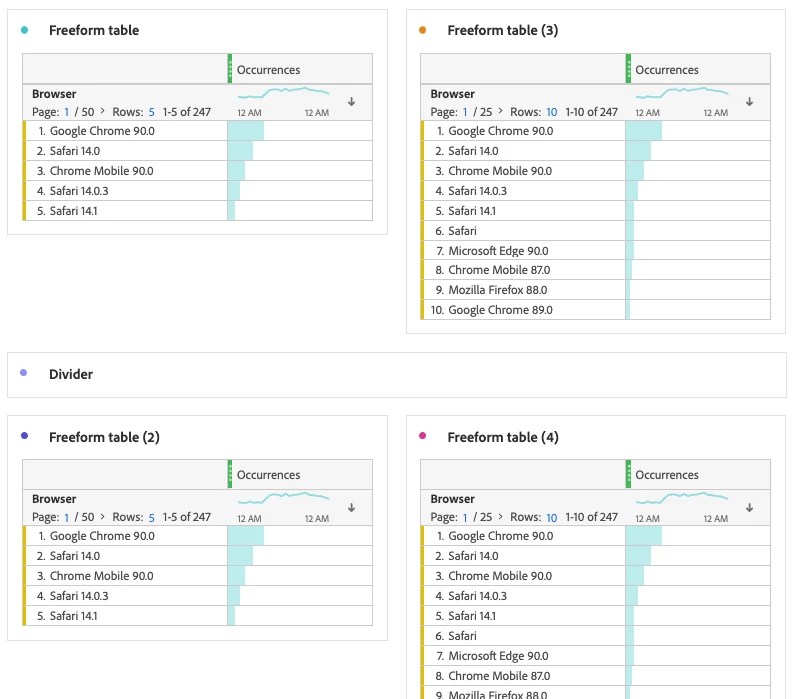
Proposal
Add a new Divider visualisation that will look as a thin horizontal line. Maybe with a configuration setting for choosing the colour (including transparent) of the line.