Using Histograms to Identify Unexpected Data Values
Histograms show the shape of your data and show how frequently every value in a data set occurs relatively unbiasedly. Histograms make it easy to see the most common and the least expected values. The horizontal axis shows your data values, where each bar includes a range of values. The vertical axis shows how many points in your data have values in the specified range for the bar.
The Histogram helps you identify the following:
- The shape of the data (e.g., symmetric, skewed, uniform, or bimodal).
- The spread and range of the data.
- The difference between two or more data sets.
- The center of the data.
- Outliers in a dataset.
The Shape of the Data
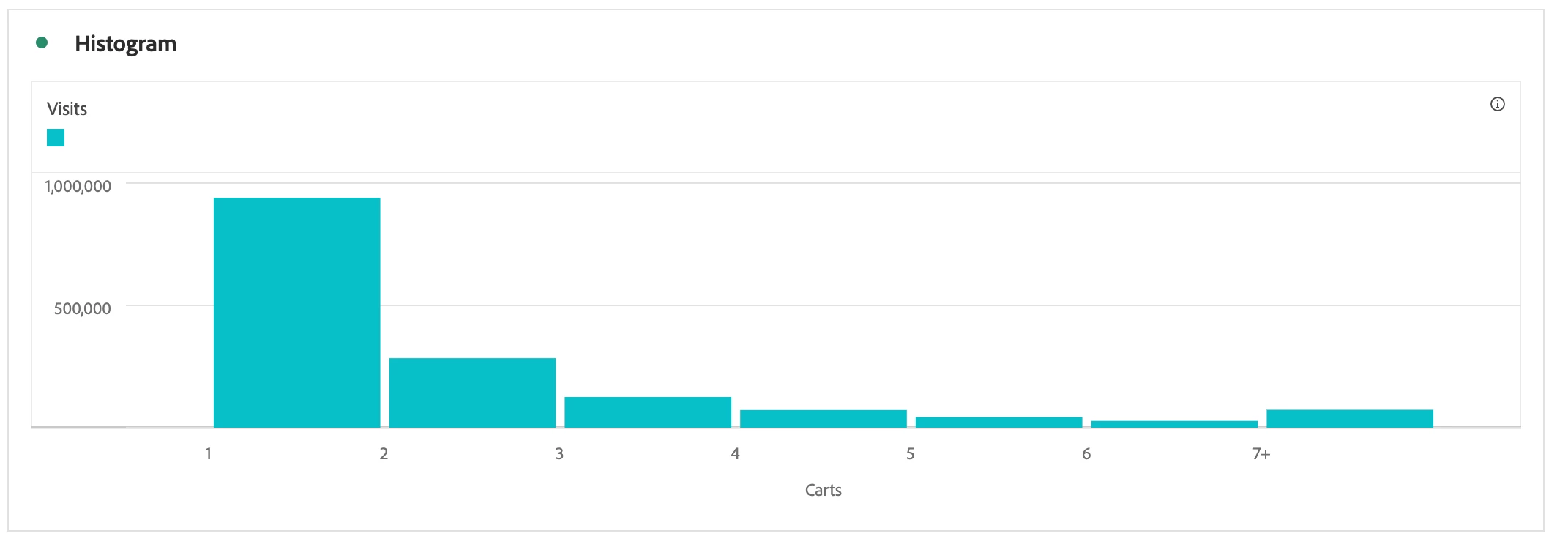
Logic entered for the use case:
- Starting Bucket = 1
- Metric Buckets = 6
- Metric Bucket Size = 1
- Counting Method = Visit
The Histogram below shows the number of times a visitor added products to their cart per session. This example shows a left-skewed histogram, as the graph's peak lies on the center's left side. A left-skewed histogram is also known as a positively skewed histogram.
Understanding the Spread & Range of the Data
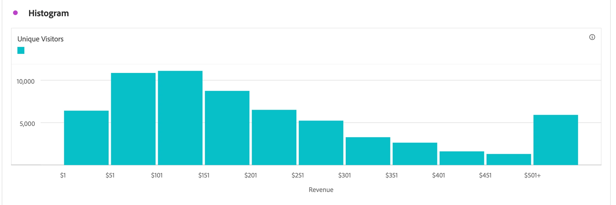
Logic entered for the use case:
- Starting bucket = 1
- Metric buckets = 10
- Metric bucket size = 50
- Counting Method = Visitor
In addition to knowing where the center is for a given distribution, we often want to know how "spread out" the distribution is, as this provides us with a measure of the variability of values taken from this distribution. The range is the difference between the highest and lowest values of distribution, although it is often reported by simply listing the minimum and maximum values seen. In the below Histogram, the maximum value seen is $501+, whereas the minimum is $1.
The Difference Between Data Sets
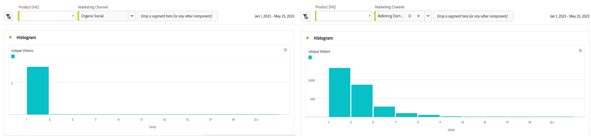
Below is the logic used for the use case:
- Starting bucket = 1
- Metric buckets = 10
- Metric bucket size = 2
- Counting Method = Visitor
Below is a side-by-side comparison of two histograms that measure units for the same product by two distinct Marketing Channels: Organic Social and Referring Domains. Using a histogram to compare the difference between these two data sets for the same product, we can conclude that the Referring Domains channel is driving orders that include more of the specified product.
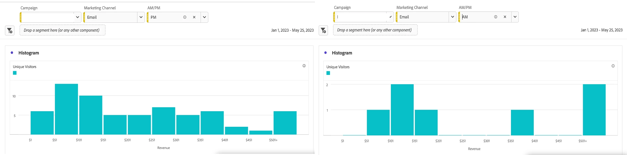
To take this use case one step further, consider adding the AM/PM variable as a drop-down menu to understand whether visitors from the specified Campaign and Marketing Channel drive revenue during AM or PM hours.
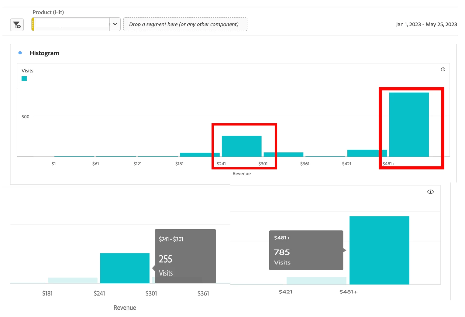
The Center of the Data & Outliers in Dataset
- Starting Bucket = 1
- Metric Buckets = 8
- Metric Bucket Size = 60
- Counting Method = Visit
We see that the center of the dataset is in the $241-$301 bucket. However, the most significant bucket is the last data point, the $481+ bucket, which is a stark difference from the size of the other buckets, classifying this data point as an anomaly in the Histogram.