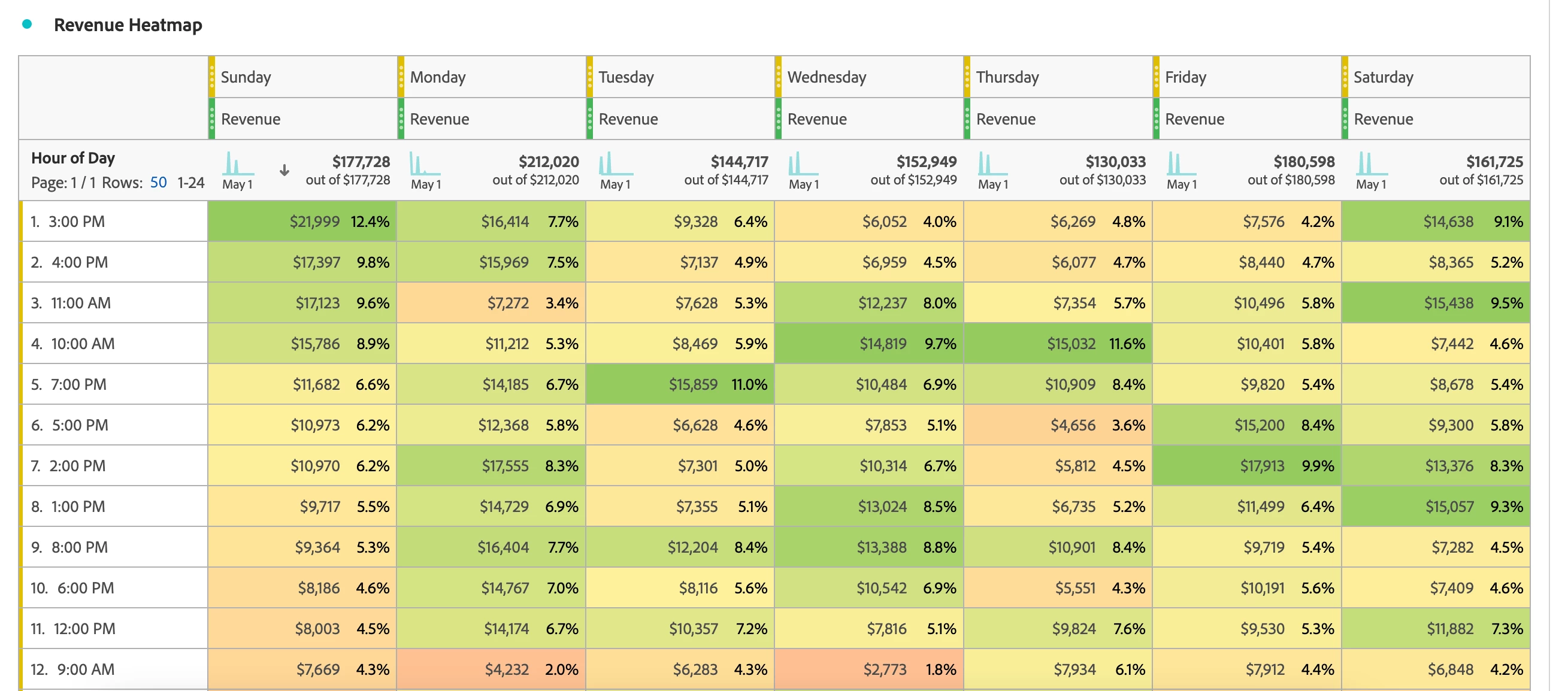
Using Conditional Formatting as a Heat Map to Identify & Monitor Values
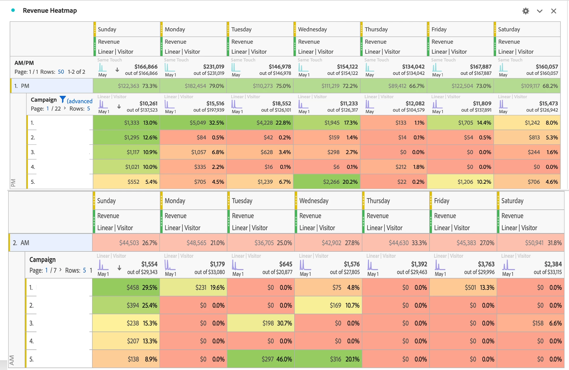
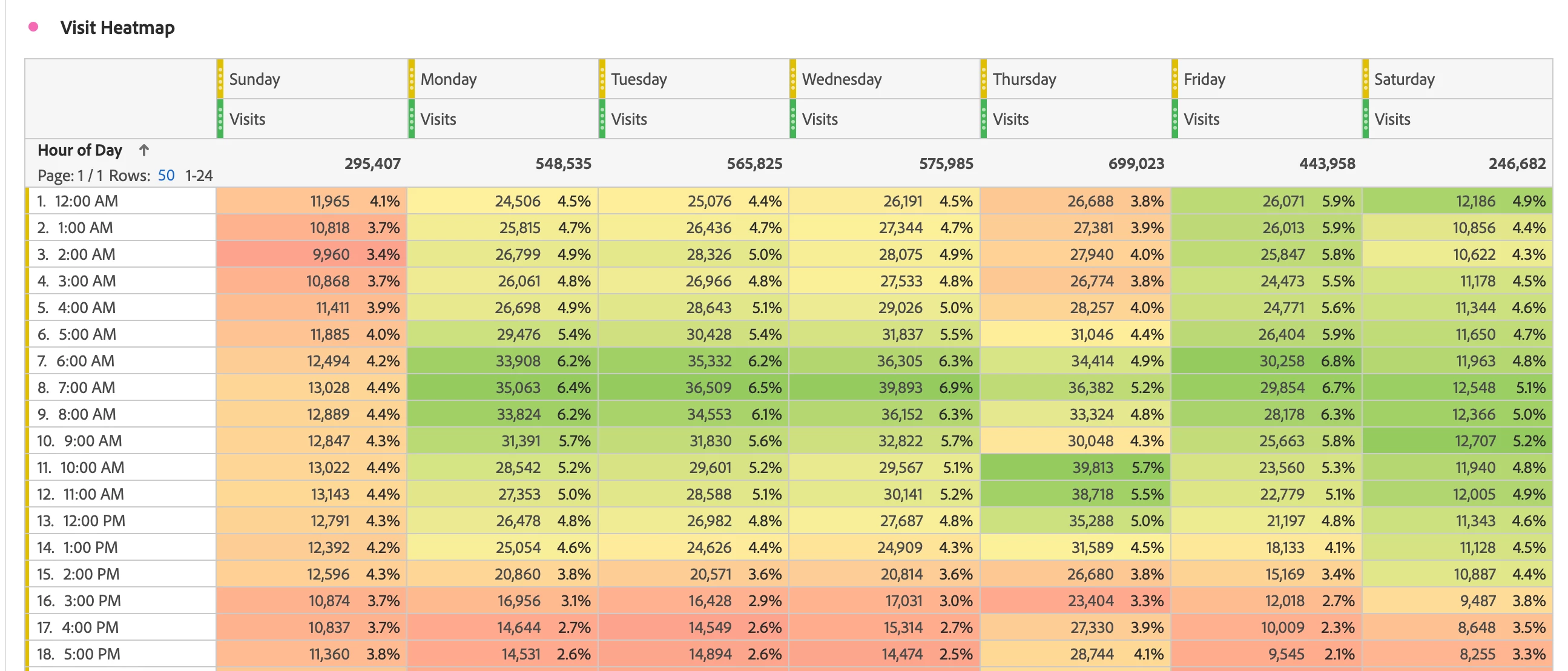
Using the Day of Week dimension (OOTB) and Hour of Day dimension (OOTB), you can create a custom heat map to understand what times and days of the week generate the most significant amount of engagement or drive the highest number of conversions. While using the Day of Week (OOTB) and Hour of Day (OOTB) dimensions produces an insightful and granular seasonality analysis, this heat map is not limited to these dimensions. For instance, swapping out the Hour of Day dimension for the AM/PM (OOTB) dimension will produce a high-level, meaningful analysis.
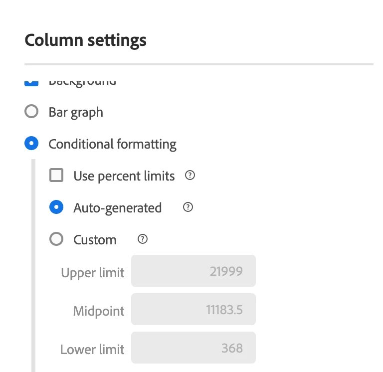
When applying the conditional formatting setting, you can use auto-generated to automatically calculate the upper limit, midpoint, and lower limit based on the data, or you can define your own custom limits.
After selecting and applying the type of conditional formatting for your analysis, your reports will appear similar to the examples shown below:
Heat map to trend engagement
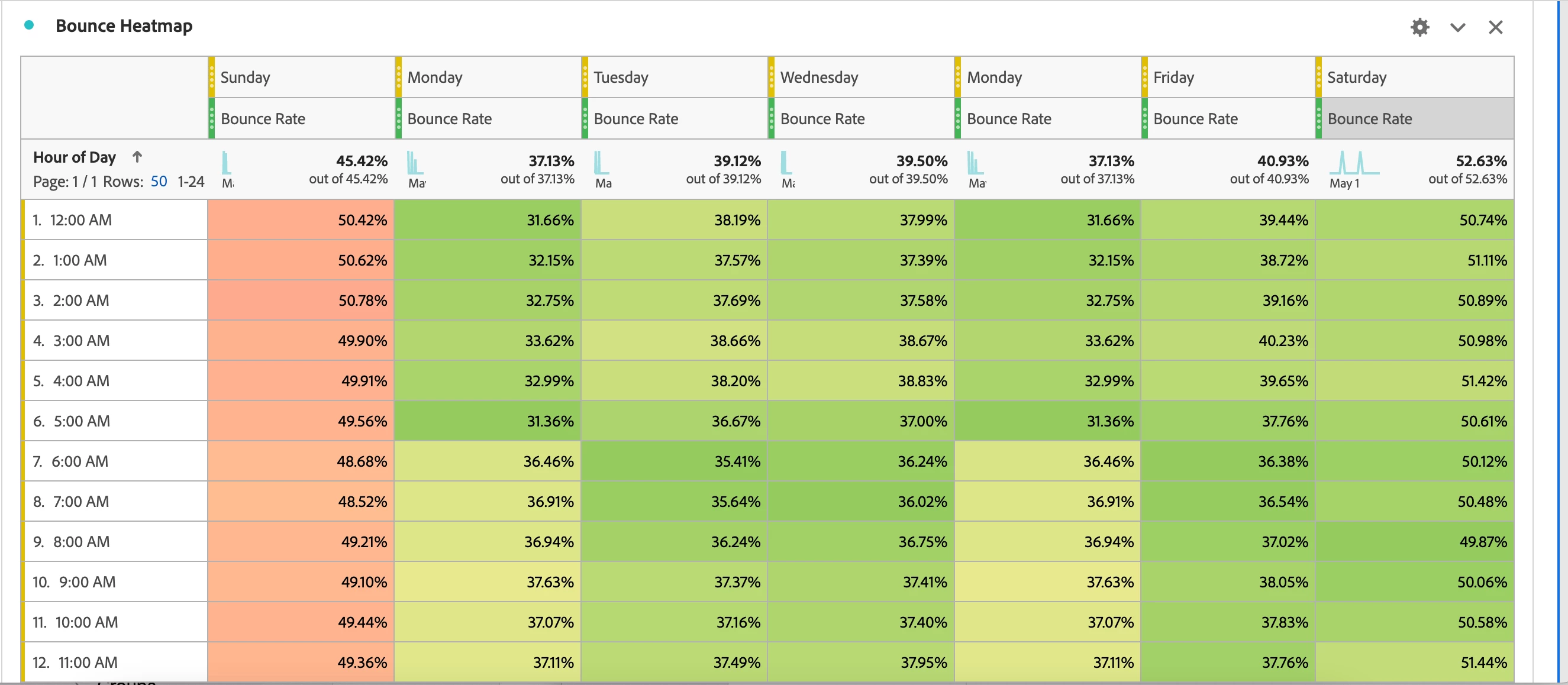
Heat map to trend conversions
Taking it one step further, you can use the AM/PM dimension broken down by campaign name variable to understand what campaigns are driving conversions based on the day of week and time of day: