
Four Adobe Analytics Tips and Tricks for Newsrooms
Analytics help you gain insight into your audience, and that is no different for news publishers. Here are some helpful hacks I’ve used that you might find helpful for your newsroom (and even other organizations).
Tip # 1: Using Custom Date Ranges for Current Events
On any given day, a lot can happen in the news. Even major global events can be hard to track in terms of timelines. You can make it easier for your editorial staff to evaluate coverage of key events by creating date ranges for these events.
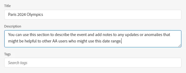
You can use tags to organize by topic, beat, or newsrooms (if you have multiple within your organization).
For events like the Olympics, you can set fixed date ranges starting from the day your newsroom started covering the event to a couple of dates after it ended (or when your newsroom has wrapped up coverage).
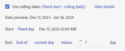
For current events that do not have foreseeable end dates or are still ongoing, you can set a rolling date that updates the date range to end on the current date (or the day before if you want to report on full days).
Make sure you share the custom date range with the appropriate user(s) or user group(s) so they can use it.
Tip # 2: Use a Time-Parting Heatmap to Understand When Visitors Are Consuming Your Content
Time-parting heatmaps are a great way to quickly see when visitors are coming to your site/app and consuming your content.
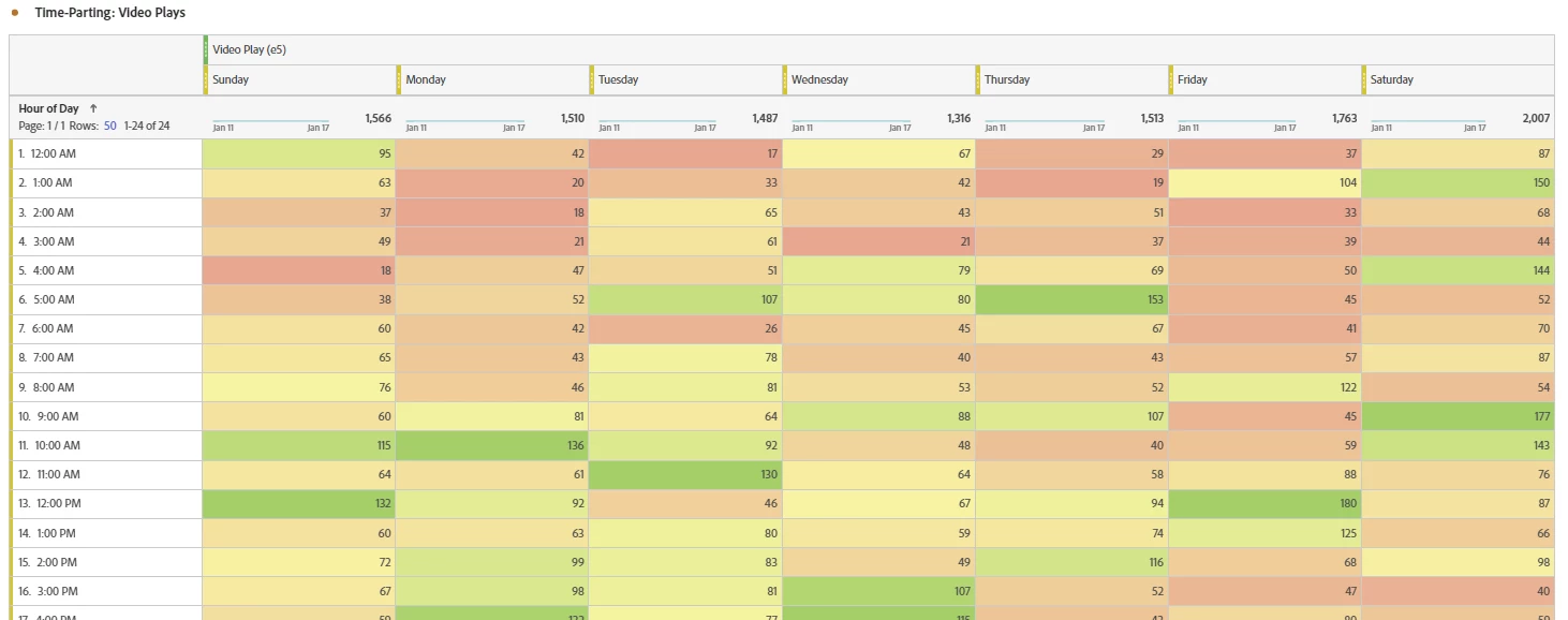
You can apply segments based on topic/beat, program, target geolocations, etc. to get insights on what programming or editorial changes need to be made. This is also a great tool to let newsrooms know peak times for audiences interested in specific topics. You can use the heatmaps to make adjustments as to when regular articles or programs are released.
If you’re covering news for a specific geographic location, you can isolate events for that market to understand their consumption habits. I once analyzed podcast consumption on a website that targeted a specific region using a heatmap; it turned out that the audience preferred to listen on the weekends, regardless of when the episodes were released.
Tip #3: Set Alerts to Know if Content is Going Viral
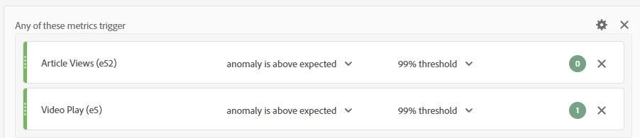
I love alerts because they are a great early warning system when something is going wrong on your website or app. In this case, however, we can leverage alerts to give us good news: published content is generating higher than usual attention.
If your Adobe Analytics instance has access to Intelligent Alerts, I found the best way to create the viral content alerts is to trigger them by using anomalies. In this case, you will want to trigger the alert if a key content consumption metric, such as an article view or video play, is an anomaly based on a high threshold.
You can apply segments to create more targeted alerts. For example, journalists can create a segment for their byline and apply it to an alert based on article view anomalies, so they can get notifications if their articles are drawing a lot of traffic.
Topic-based segments can be a little tedious to maintain, but building alerts using those segments is useful for understanding how a newsroom’s coverage around that topic is performing.
You can also use segments to exclude content that you may not want to trigger your alert. If your sports coverage usually triggers the alert during specific events, you may want to exclude them from your general alerts and set up a separate one to avoid false positives.
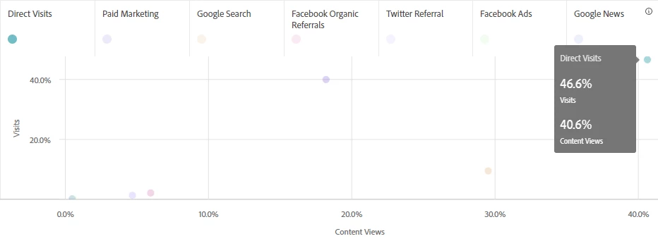
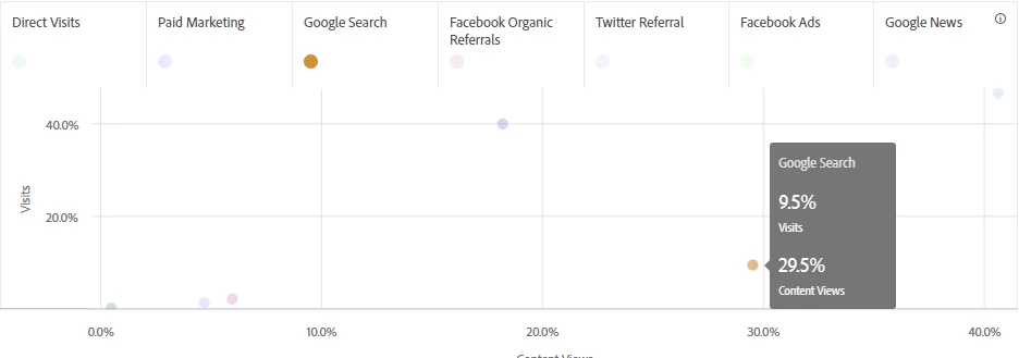
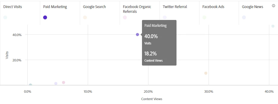
Tip # 4: Use a Scatter Visualization to Identify Effective Traffic Sources
Not all traffic sources are equally effective. To understand which traffic sources provide the most value, the first step is to identify which outcomes (or metrics) are generated by these traffic sources. In this example, we want traffic sources to generate traffic and content consumption on the website. You can plot visits and content views (the sum of article views, video plays, and audio plays) by referring domain, but I prefer to use segments for a cleaner breakdown of these traffic sources.
I create a freeform table with the segments as dimensions with visits and content views as the metric columns, and I use the table as the data source for this scatter visualization:
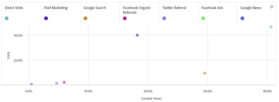
For the visualization settings, I turn on the Percentages option to normalize the data.
What does this table tell me about this website’s traffic sources?
The first thing I see is that this website may have an attribution issue. Its most effective traffic source is direct traffic. This segment already excluded any traffic with campaign tracking, but it still accounts for almost half of visits and content views. This newsroom may need to re-examine its marketing efforts to make sure incoming traffic are tracked as much as possible.
If the newsroom has limited resources, they may want to focus on search optimization efforts. That segment may only account for 10% of visits but almost 30% of content views, which may mean that search is effective in converting referrals to consume content.
On the other hand, the newsroom may need to make adjustments to its paid marketing campaigns. Those efforts generated almost half of traffic, but they are not effective in converting those visits to content views.
You can apply different segments to this visualization to get additional information about the site audience. Applying geo-based segments gives us insights on what platforms would be more effective in reaching audiences within a country or region. If journalists are interested in helping promote their content, they can apply their own byline segment to see which social media platform has been effective in driving traffic to their articles. They can grow a presence on those platforms (if they do not already) and engage users to drive them to their articles.
-------
Do you have any questions about how to use Adobe Analytics in your newsroom? Have you used any of the tips before, and want to share your lessons learned? Does your newsroom have any AA tips you want to share? Please share them in the comments. I also would love to meet other Adobe Analytics users, especially from the news publishing space, so please feel free to introduce yourself in the comments as well.