Expand my Community achievements bar.

Submissions are now open for the 2026 Adobe Experience Maker Awards.

New Calendar UI/UX: Ability to Expand top portion of calendar or toggle off hourly blocks of time in Weekly View

Avatar

Community Advisor

4/2/25

Description - Allow the option to hide the hourly breakdowns on weekly calendar view or expand the collection of calendar items in the top portion of the calendar

Why is this feature important to you - We have many tasks that pull into a calendar view and the many tasks are now all scrunched together at the top. When the list is super long, a scroll bar appears and you can scroll within the tiny area. There is not a way to hide the hourly blocks below or expand the top portion to have better visibility into the items like the current/old calendar weekly view.

How would you like the feature to work - Add a toggle button to hide the hourly blocks and/or a way to expand the top portion of the calendar to be able to see more items on the screen.

Current/Old Behavior -
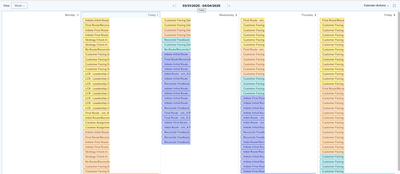
 

Screenshot 2025-04-01 at 9.05.50 AM.png


New Calendar

Screenshot 2025-04-02 at 9.04.27 AM.png

25 Comments

Avatar

Level 5

5/15/25

Hi all! I sent some feedback to our Account Support and should be having a quick call with Product soon to go over this. They did mention some of these changes were to align with Workfront Planning's calendar; however, changes for the other tool should not negatively impact how standard Workfront calendars work. I would imagine some of these needs would be good to address in that tool, also. I am taking our feedback plus all from here to discuss with them. They seem very open and helpful about this feedback, so that is great news! I am sure someone will respond here at some point, but I got impatient since this has been a big impact on the day-to-day work for many of us. We are a creative studio within the organization, so visual components like calendars are a big help here. 

Avatar

Level 1

5/19/25

The former calendar view was much more user-friendly and better represented workload to our management team. I also liked the former function that allowed us to hide and show weekends.

Avatar

5/19/25

Adding to this as well. the new UI is horrible and difficult to read. Please allow options for the previous view/layout that shows things as days instead of hours. 

Avatar

Level 1

5/20/25

I agree with the comments above. The old calendar was much better for our purposes and the new calendar has made our weekly production planning almost impossible.