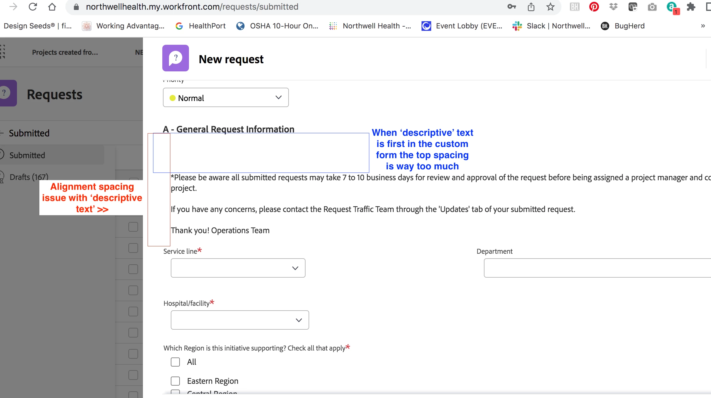
Custom Forms spacing
Description - When creating custom forms, if the form starts with a 'Descriptive' text field the top spacing and left side alignment is off. You can easily tell theirs way too much top spacing and then from the left the descriptive text is not aligned to any of the other custom form fields.
Why is this feature important to you - We have over 3,000 clients/requesters that use these forms. And this looks messy and seems to be a direct reflection on the marketing team, where we have no control over. The descriptive copy is important for the requesters to review and read so they understand HOW to use the form.
How would you like the feature to work - Universally the custom forms spacing and alignment should be reviewed and be the same throughout.
Current Behavior - Messy, see screenshot