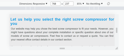
Issue with margin for window while resizing window
- Mark as New
- Follow
- Mute
- Subscribe to RSS Feed
- Permalink
- Report
I have added margin left/right for div tag.
when I resize with the emulator, there is no issue with margin left/right on mobile,tablet and desktop view.
However, without the emulator, when just resized, we are losing the margin on left and right side and this happening for window users not for mac
Can anyone help me to fix this
Solved! Go to Solution.
Views
Replies
Total Likes

- Mark as New
- Follow
- Mute
- Subscribe to RSS Feed
- Permalink
- Report
you must not write CSS for infinite view port breakpoints.
Test only with your desired breakpoints, if rest is broken it is fine.
In real world nobody resize the screen,
User either go to landscape or portrait mode in mobile and desktop stick to large view port.
but make sure, things works in defined view port and breakpoints.
https://www.lambdatest.com/blog/how-to-use-css-breakpoints-for-responsive-design/
Arun Patidar

- Mark as New
- Follow
- Mute
- Subscribe to RSS Feed
- Permalink
- Report
css
/*!
 * Copyright 2019 Atlas Copco. All rights reserved.
 */


.grey-container {
    & > div {
        padding: 3rem 0;
        background-color: $color-grey-lighter;
        //fix so grey-container will be full width despite parent parsys container
        width: 100vw;
        position: relative;
        left: calc(-50vw + 50%);
    }

    .grey-container--narrow {
        width: 100%;
        left: auto;
        right: auto;
        margin-bottom: 1rem;
        background: linear-gradient(to right,$color-grey-lighter,$color-grey-light) !important;
        padding: 35px;

    }

    @include rtl {
        right: calc(-50vw + 50%);
    }

    &--white {
        background-color: #fff;
    }

    &__header {
        max-width: 69rem;
        margin: 0 auto;
        width: 100%;
        text-align: center;
    }

    &__content {

        max-width: 69rem;
        margin: 0 auto;
        width: 100%;
        min-height: 100%;

        .paragraph p {
              margin: 0;
       }

       .paragraph--regular {
          margin-top:-5px;
       }

       .subtitle.s-editor h2 {
          margin: -5px 0px -5px 0px;
       }

        .o-grid--border{
            margin: 4px 0 4px 0;
            padding: 0;

            .o-grid__item{
                padding: 4px 1% 4px 0;
            }
        }

        .paragraph-with-image {
              margin: 0 2px 0 5px !important;
            }

        .s-editor {
            margin-right: 5px;
              margin-left: 5px;
              margin-bottom: 0px;
        }

        .c-parsys-divider__item{

            padding: 0;
            max-width: 66.8rem;
            position: relative;
            text-align: justify;

           .s-img-container {
              margin-bottom:0rem;

              .s-img {
                 margin-bottom: 10px;
                 margin-top: 0px;
              }

           }

            @include rtl {
                text-align: right !important;
            }
        }

       .c-parsys-divider__item:last-of-type {
           @include padding-bottom(0);
        }

        @include mq(69rem) {

            .card-with-image--medium{
                margin: 0;
            }

        }

        .c-row--divider {
            margin: 0 1.1rem;
        }

       .talk-to-us-banner {
              margin: 0 1rem;
           }

    }

    &__title {
        font-size: 1.8rem;
        color: $color-beta;
        font-weight: 400;
        border-bottom: solid #fff 3px;
        padding-bottom: 1rem;
        margin-left: 20px;
        margin-right: 20px;
    }

    .generated-list-container .linkview-title {
        margin-left: 0.6rem;
        @include rtl {
            margin-right: 0.6rem;
            margin-left: 0rem;
        }
    }

    .generated-list-container .linkview-description {
        margin-left: 0.6rem;
        @include rtl {
            margin-right: 0.6rem;
            margin-left: 0rem;
        }
    }
}

// ACAS-4517. When the grey banner is placed inside the columns, the padding is reduced.
.columns {
   .o-grid{
      .grey-container {
         & > div {
            padding: 18px 0px 15px 0px;
            .paragraph p {
                 margin: 0;
              }
         }
         .grey-container__content {
            .s-editor {
               margin: 0 20px 0 20px !important;
            }
         }
      }
   }
}
HTML
<div class="grey-container">
<div>
<div class="grey-container__content">
<div class="aem-Grid aem-Grid--12 aem-Grid--default--12 ">
<div class="subtitle s-editor c-parsys-divider__item aem-GridColumn aem-GridColumn--default--12">
<h3 class="u-h4 u-mb-beta">
Let us help you select the right screw compressor for you
</h3>
</div>
<div class="columns c-parsys-divider__item aem-GridColumn aem-GridColumn--default--12">
<div class="o-grid">
<div class="o-grid__item u-1-of-1-bp2 u-1-of-2-bp4 ">
<div class="aem-Grid aem-Grid--12 aem-Grid--default--12 ">
<div class="paragraph s-editor c-parsys-divider__item s-editor--para aem-GridColumn aem-GridColumn--default--12">
<div>
<p>Our website may help you chose the best screw compressor to fit your needs. However, you might have questions about your complete installation or specific question about one of our models of screw air compressors. Feel free to contact us or request a quote. You can find your nearest office contact details in our contact section.</p>
<p> </p>
<p>You can browse the selection of screw compressors here on the website and explore our other products such as compressed <a href="/en-international/compressed-air-dryer">air dryers</a><span>, </span><a href="/en-international/air-compressor-filter">filtration</a><span>, and </span>condensate management products like <a href="/en-international/condensate-management">oil-water separators</a><span>.</span></p>
</div>
</div>
</div></div>
<div class="o-grid__item col__right u-1-of-1-bp2 u-1-of-2-bp4 ">
<div class="aem-Grid aem-Grid--12 aem-Grid--default--12 ">
<div class="paragraph s-editor c-parsys-divider__item s-editor--para aem-GridColumn aem-GridColumn--default--12">
<div>
<p style="text-align: justify;">Visit our blog if you want to learn more about screw compressors, compressed air dryers and other compressed air topics.<br />
</p>
<p style="float: left;font-size: 17.0px;text-align: center;width: 30.0%;margin-right: 1.0%;margin-bottom: 0.5em;"><a href="/en-international/compressed-air-blog"><img alt="air compressor" width="100%" src="/content/dam/brands/Mark/icons/Blog.png"/><br />
<b>Blog</b></a></p>
<p style="float: left;font-size: 17.0px;text-align: center;width: 30.0%;margin-right: 1.0%;margin-bottom: 0.5em;"><a href="/en-international/request-service"><img alt="air compressor" width="100%" src="/content/dam/brands/Mark/icons/Talk-to-us.png"/><br />
<b>Contact form</b></a></p>
<p style="float: left;font-size: 17.0px;text-align: center;width: 30.0%;margin-right: 1.0%;margin-bottom: 0.5em;"><a href="/en-international/air-compressor-for-sale"><img alt="air compressor" width="100%" src="/content/dam/brands/Mark/icons/More-info.png"/><br />
<b>Sales and support</b></a></p>
</div>
</div>
</div></div>
<span style="clear: both;"></span>
</div>
</div>
</div>
</div>
</div>
</div>
no issue with emulator
issue is when resizing window

- Mark as New
- Follow
- Mute
- Subscribe to RSS Feed
- Permalink
- Report
you must not write CSS for infinite view port breakpoints.
Test only with your desired breakpoints, if rest is broken it is fine.
In real world nobody resize the screen,
User either go to landscape or portrait mode in mobile and desktop stick to large view port.
but make sure, things works in defined view port and breakpoints.
https://www.lambdatest.com/blog/how-to-use-css-breakpoints-for-responsive-design/
Arun Patidar


- Mark as New
- Follow
- Mute
- Subscribe to RSS Feed
- Permalink
- Report
Hi @Vani1012
From my perspective, whenever we are validating responsive UI on a desktop browser via emulator or window resize, it is always better to load the page after resizing to get the config load properly which would be an ideal test scenario as well. For your case, please validate if the issue is coming after the page load as well then
- if yes, then you should validate on the actual device as well for confirmation.
- If no, then it should work fine on actual device.
Regards,
Arpit Varshney
Views
Like
Replies


