AEM Column creation fr editable template | Community
Skip to main content
arjuns71585267
Level 4
March 13, 2019
Solved

AEM Column creation fr editable template

  • March 13, 2019
  • 6 replies
  • 4796 views

I was trying to create columns using the column control component in AEM. It is not having a documentation and the component is not working as  expected. How to solve this issue?

Is there any way to divide the site into a 3 column layout using any of the components in the editable template? suppose I want to divide the page as in the layout below how should be the coding done? Appreciate the help at the earliest.

col1 with some contentscol2 with some contents
col3 with some contents
This post is no longer active and is closed to new replies. Need help? Start a new post to ask your question.
Best answer by Prince_Shivhare

see the below code-snippet.

<div class="container-fluid">

  <h1>Hello World!</h1>

  <p>Resize the browser window to see the effect.</p>

  <p>The columns will automatically stack on top of each other when the screen is less than 768px wide.</p>

  <div class="row">

    <div class="col-sm-4" style="background-color:lavender;">.col-sm-4</div>

    <div class="col-sm-4" style="background-color:lavenderblush;">.col-sm-4</div>

    <div class="col-sm-4" style="background-color:lavender;">.col-sm-4</div>

  </div>

</div>

check this link :::: Tryit Editor v3.6

now put the parys in replace of content written in bold.

<div class="col-sm-4" style="background-color:lavenderblush;">

<div data-sly-resource="${'par1' @ resourceType='wcm/foundation/components/parsys'}"></div>

</div>

6 replies

VeenaVikraman
Community Advisor
Community Advisor
March 13, 2019

What is the CSS framework you are using foryour FE ? is it bootstrap ? If so you can create a custom component something like Creating a custom Touch UI Grid Component for Adobe Experience Manager

arjuns71585267
Level 4
March 13, 2019

yes,bootstrap or flexbox for the above layout.

Prince_Shivhare
Community Advisor
Community Advisor
March 13, 2019

In this case, I will go with bootstrap because it is also helpful for responsive design.

while creating a col-cntrl you can also put the parsys there using specific div. so parsys will also behave like that.

Check this article, here we have used the Tab component. so it is also responsive we have used the bootstrap here.

Creating a Tab layout component for Adobe Experience Manager

arjuns71585267
Level 4
March 13, 2019

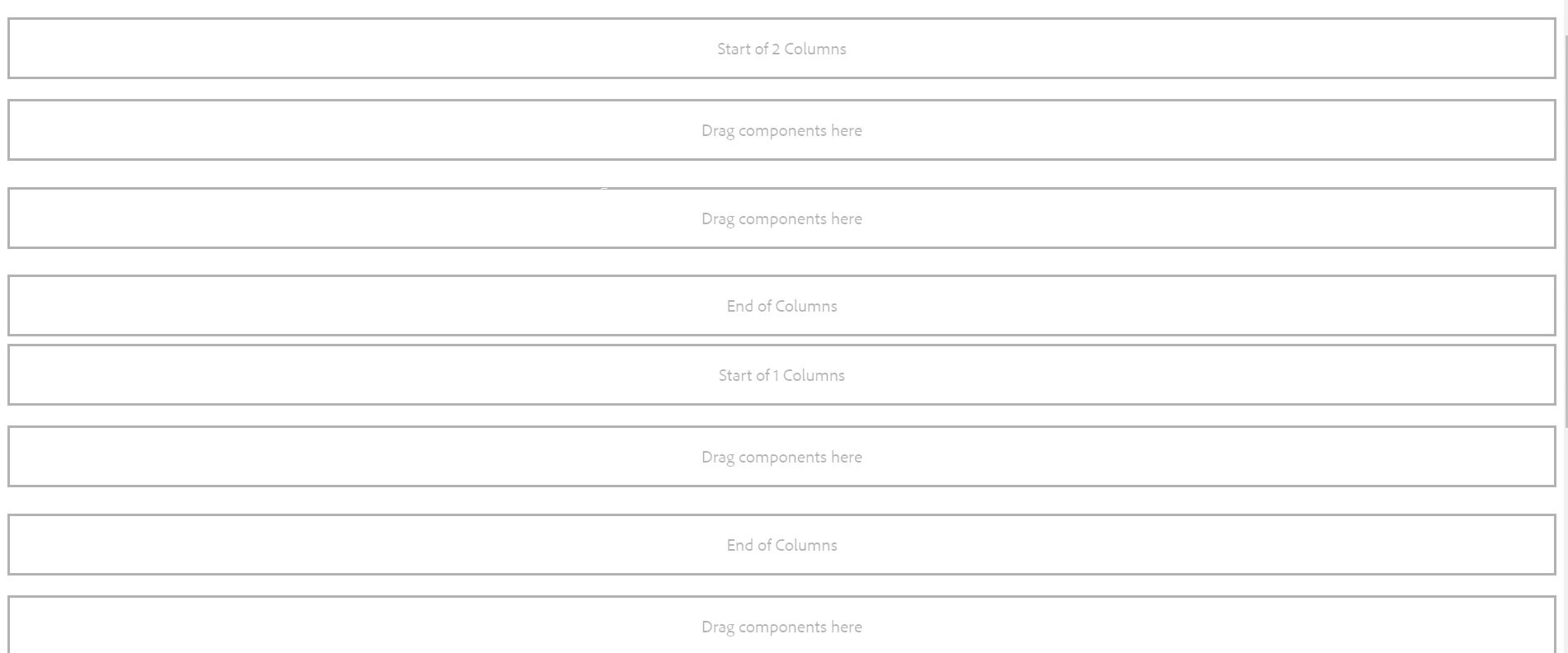
can you explain the working of the col control component? It is not actually working or nor can I see it is dividing into columns.

see the screenshot

Prince_Shivhare
Community Advisor
Prince_ShivhareCommunity AdvisorAccepted solution
Community Advisor
March 13, 2019

see the below code-snippet.

<div class="container-fluid">

  <h1>Hello World!</h1>

  <p>Resize the browser window to see the effect.</p>

  <p>The columns will automatically stack on top of each other when the screen is less than 768px wide.</p>

  <div class="row">

    <div class="col-sm-4" style="background-color:lavender;">.col-sm-4</div>

    <div class="col-sm-4" style="background-color:lavenderblush;">.col-sm-4</div>

    <div class="col-sm-4" style="background-color:lavender;">.col-sm-4</div>

  </div>

</div>

check this link :::: Tryit Editor v3.6

now put the parys in replace of content written in bold.

<div class="col-sm-4" style="background-color:lavenderblush;">

<div data-sly-resource="${'par1' @ resourceType='wcm/foundation/components/parsys'}"></div>

</div>

VeenaVikraman
Community Advisor
Community Advisor
March 13, 2019

Make sure you have all the bootstrap related css and JS included in your page . Then this component will work like magic.