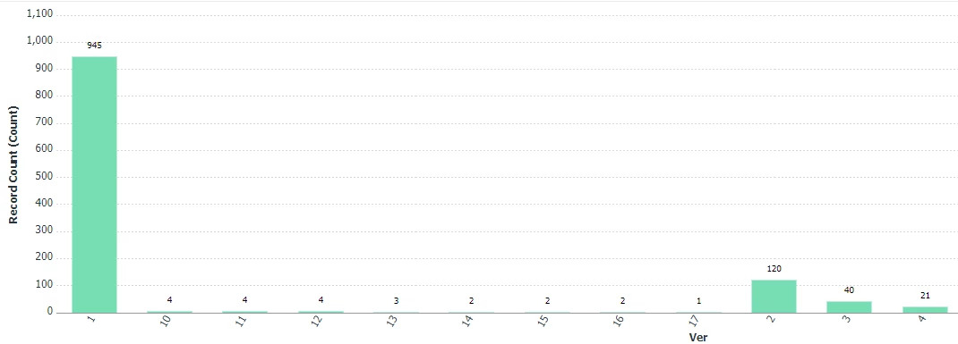
Hi there, I created a document version report I've used at a couple orgs to help show trend in avg # of versions (rounds) on proofs. You can filter this for proofs from any specific home group or home team, etc. as well as upload timeframe. You can have this be a bar chart and hopefully over time you're seeing the trend go down (fewer rounds per proof).
NOTE: this is only a credible report if your users are versioning correctly, instead of uploading an entirely new proof for every round.
Example - it shows # of versions/rounds on X axis and how many proofs went that many rounds on Y axis. Helps find outliers (like why do we have any proofs going these double-digit rounds? and can click into them to find more).
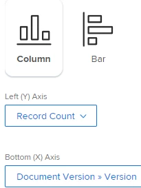
This is how to build it:
Document version report
Columns:

Groupings:
group.0.groupdatesby=MY
group.0.linkedname=direct
group.0.name=Upload
group.0.notime=false
group.0.valuefield=entryDate
group.0.valueformat=atDateAsMonthString
group.1.iscollapsed=true
group.1.linkedname=direct
group.1.name=Versions/Rounds
group.1.valuefield=version
group.1.valueformat=string
textmode=true
Filters:
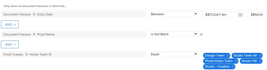
Chart: