Question
Change to Kanban card look?
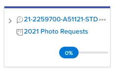
Was there a recent change to the way Kanban cards look? This is what they are looking like today. I can see the advantage of having the project name there for most teams, but for this particular team all their issues are in the same project. So the project name is just noise for them and it takes up space where the issue name used to wrap, and they are clicking the project name link by mistake and going into the wrong place.
I'm not finding anything in the enhancement release notes about this. We would definately prefer that the project name is one of those optional fields that you can add if needed.