Assignee Wise Actual vs Planned Hours | Community
Skip to main content
March 3, 2023
Question

Assignee Wise Actual vs Planned Hours

  • March 3, 2023
  • 3 replies
  • 1443 views

Hi Workfront Community,


For my ticket management project, I am trying to create a report for Team Leads that shows planned vs actual hours split my month for each assignee in the team.

This is how it looks like for now for a single assignee:

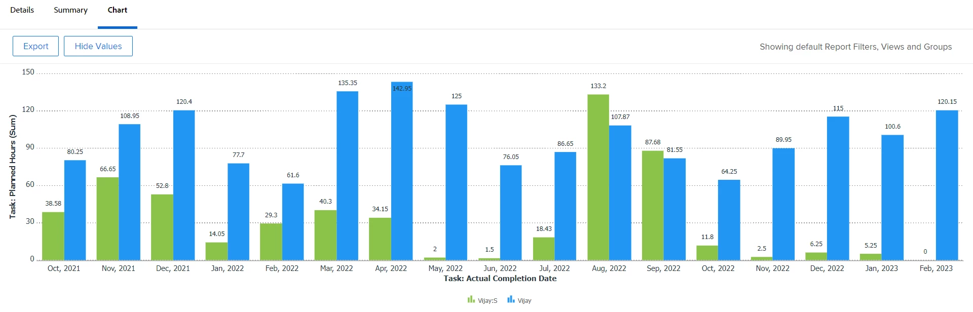
Now, if I add more assignees to this, this will look completely messes up.

Is there a way I can simplify this for all assignees at one place? Or a way I can give a dropdown of assignees to the TL where from they can choose and view the chart for each one by one?

This post is no longer active and is closed to new replies. Need help? Start a new post to ask your question.

3 replies

Madalyn_Destafney
Community Advisor
Community Advisor
March 3, 2023

Hi there! I agree, if you add more people to this it's not ideal for a chart, unless you could try the stacked column chart option to see how that looks first:

If that's still too busy, you can either:
- Have the report default to the Details view instead, with a collapsed grouping by person.

- Leave your chart how you have it and create a report prompt that prompts the TL to choose which team member they want to see, then the report runs only showing that person. I think that's the best route to go.

If this helped you, please mark correct to help others : )
Madalyn_Destafney
Community Advisor
Community Advisor
March 3, 2023

I also forgot to mention, @varnikaja2 - have you looked into the resource management tools in WF (Workload Balancer, Planner)? Other native ways you can show planned vs actual hours by team, role, user, etc.

If this helped you, please mark correct to help others : )
March 9, 2023

Hi @madalyn_destafney ,

The prompt options does the job. But its still tedious process because we have many users working under a TL and selecting one by one for each take lots of time.

let me try 'resource management tools in WF (Workload Balancer, Planner)'

Doug_Den_Hoed__AtAppStore
Community Advisor
Community Advisor
March 3, 2023


Hi @varnikaja2 ,

I invite you to consider our Capacity Charts solution, which which you can easily create insightful resource management reports such the as planned vs actual hours per month by team member you are currently trying to accomplish.


Regards,

Doug

Rafal_Bainie
Community Advisor
Community Advisor
March 3, 2023

I would throw one more idea if visual aspect is not essential - matrix report could something like that:

    Jan Feb Mar Apr May Jun
User1 Pln            
  Act            
User2 Pln            
  Act            
User3 Pln            
  Act            
March 6, 2023

Hi @rafal_bainie ,

If you don't mind, can tell me how did you create the matrix view?

Thanks,
PK


Rafal_Bainie
Community Advisor
Community Advisor
March 6, 2023

Sure,

  1. create a task report
  2. make sure to include both Planned Hours and Actual Work in view
  3. make sure that both fields are summarized by SUM
  4. in groupings tab, switch to matrix (you do this in top right corner) and use following settings:

    although you most likely want montly groupings in column

  5. optionally in matrix settings you can setup some conditional formatting on aggregated fields to make the report easier to read.

Hope this helps