Maximize the Display in the Resource Planner (Show more Columns and Rows!)
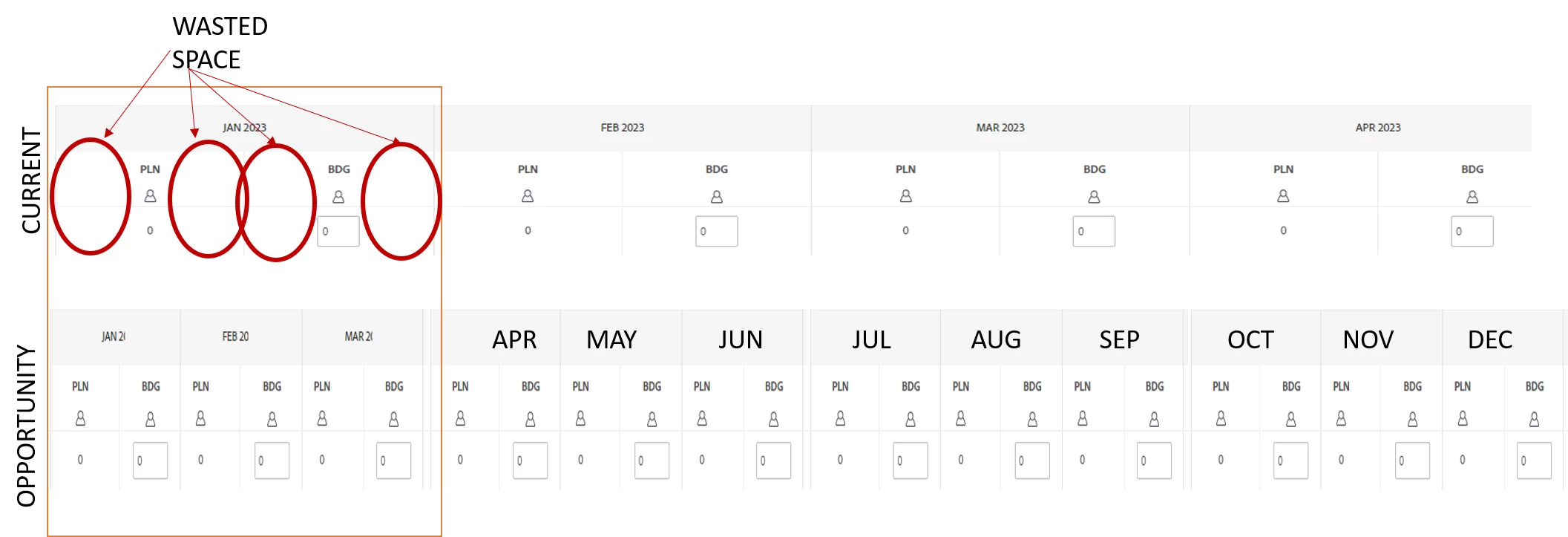
Description - There is a lot of wasted screen real estate in the resource planner which means users have to scroll to the side just to see a years worth of data (MoM). There is plenty of space wasted in between columns and rows.
Why is this feature important to you - By reducing the space between columns I could see a full years worth of data (maybe more) which is essential for annual planning and will reduce the likely hood of reverting to a spreadsheet. (Vertical optimization should also be considered)
How would you like the feature to work - Reduce the padding around the elements and utilize the space freed up when elements are removed from view
Current Behaviour - The current interface wastes an inordinate of space which is inefficient and frustrating (image attached)