New
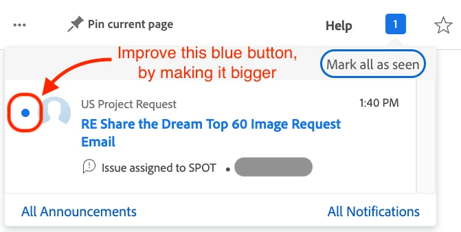
In-App Notifications - Make the "mark as read" button bigger
I'm passing on an idea from users from our in-house Web Design team to make the experience of checking off notifications in the in-app notifications area easier by simply making the blue dot bigger and easier to click on.
The complaint is that because the target area is so small, it is difficult to click just right to activate the button and that makes it frustrating to the user when there are sometimes hundreds of notifications to mark as read -- that must be marked individually.
Making this change to the "mark as read" button would be simple to implement as a "look and feel" type of improvement and would give the user a bigger target area than something just a few pixels wide relative to the message space.