New
Fix "favorites" display (bar of apps used in a scenario)
Description -
- Fix how the "favorites" bar works
Why is this feature important to you -
- It's bad UX and after 6 of those apps the menu gets truncated.
- it's not really favorites since it keeps any app that has a module placed in the canvas
How would you like the feature to work -
- If it's "all apps used in this scenario"
- Don't name it "favorites"
- If it's "favorites"
- Don't remove apps when not used in a scenario
- Same faves across all scenarios (ie, user-based)
- In either case
- App bar should be scrollable
- The + (add) should be always visible (currently it moves outside the viewport)
- The popup menu of the app's modules should be placed so the right edge is within the viewport
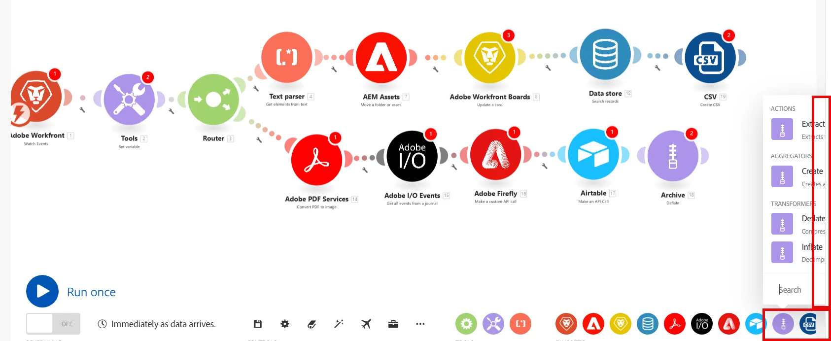
Current Behaviour -
- one icon per each app in scenario (whether connected or orphan)
- not "favorites" but specific to scenario
- re-generated when going into edit mode (apps that are not used in the scenario get removed)
- length of favorites bar grows with window width
- as apps fill bar the popup menu becomes unusable due to placement