Expand my Community achievements bar.

Join us LIVE in San Francisco on November 14th for Experience Makers The Skill Exchange. Don't miss out on this free learning event!

Add some visual pizzazz to your Workfront

Avatar

Employee

Creative teams tend to have users that are very visually-oriented. Here are some ideas to make Workfront more user-friendly and enticing for the team (even for groups outside of Creative)!

Encourage everyone to have a profile picture

Especially as your user base grows, you’ll start having duplicate names. A picture helps everyone ensure they’re tagging the right person in updates, tasks, etc. A picture can be much easier to identify in a list than rows and rows of the default gray user icon. Putting a face with the work can make a remote work setting feel more personal, too. Their picture doesn’t necessarily have to be their face though, just something unique to them - a pet, an emoji, or even a favorite character works, too.

Use color in your views and reports

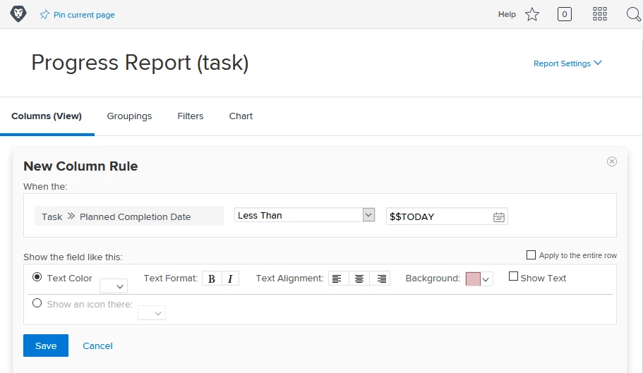
Make information easier to digest at-a-glance. Is something past due? Turn the box red using conditional formatting. Just be careful not to make everything a color - only call out what’s really important. Below, I'm comparing the planned completion date with the wildcard $$TODAY, so the report is always up-to-date.
0694X00000C2K3fQAF.png

Want to take it to the next level?

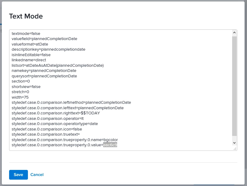
You can customize the colors by changing the Hex color code in text mode. Swap the six digits with the six digit color of your choice. If you're not familiar with hexadecimal color codes, there are tons of hex color tools online or you can search something like "hex teal color" or "hex magenta code" online and find a shade you like. Only put in the numbers here, you don't need the #.
0694X00000C2K4EQAV.png

Pro tip: Build out the report or view exactly as you want it before you go into Text Mode to change the colors. Any edits you make in Text Mode can make it a little more complicated to update in the future. You may lose some settings if you switch back to Standard Mode. Color adjustment should be the very last thing you do. You’ll also want to make sure you view your work when you’re done to ensure the text is still legible on the background color.

This blog post walks through a similar example and also has some great details on how to update colors on charts, too.

What are some things you’ve done to help your creatives visualize their work in Workfront?

@Creative Agencies@Marketing

Topics

Topics help categorize Community content and increase your ability to discover relevant content.

14 Replies

Avatar

Level 10

Hi - So I cannot remember who was the awesome person who created these a long time ago, but they have been wonderful. For new teams and departments, I have been using these for avatars just to make things more visual when assigning or tagging people.

It is also AMAZING when you have two people with the same name in different departments or groups. You can give them different colors. Like we have two Stephanie Smiths so there is Blue Stephanie and Red Stephanie. LOL!

Of course, I encourage people to upload their own avatars, but sometimes you might have people who interact with the Workfront interface infrequently, so nice to still have something there.

Avatar

Employee

Ooh, I love that! Excellent tip, Anthony! Thanks for sharing the files, too. 👍

Avatar

Community Advisor

If you just want to use your own hex colors in place of Workfront's default colors, you go into text mode, replace the colors and go back to standard mode and the colors will hold. This gets you the colors you want and keeps the rules in easy-to-read standard mode.

I think I saw somewhere an automated way to do first & last initial avatars. I thought it was either the atappstore.com or wfPro.com but I can't find it now.

Avatar

Community Advisor

Wow, it's nice to see that a weekend project of mine from more than three years ago is still paying dividends to the community today.

I brought these from Disney over to T-Mobile, and it's crazy to think that my homegrown avatars are being used for thousands; maybe tens of thousands of users!

For those of you already using this style and are also Fusion customers, I am working up a scenario that will automatically apply an avatar to new users when they join the system. Same concept as Doug's but for those of us that are already vested in this design. Stay tuned on that one.

If you like my content, please take a moment to view and vote on my Idea Requests: https://tinyurl.com/4rbpr7hf

Avatar

Community Advisor

Can't wait to see how your Fusion scenario goes. I was just thinking about that myself when I saw Doug's concept. Definitely let us know once that takes off.

Avatar

Level 1

I would love to use the default/color avatars. Would someone mind telling me how to apply them?

Avatar

Level 7

OMG YES.

I'm thinking through a massive integration between Workfront, AD, and ServiceNow in order to auto-generate as many user profiles as possible. (I'm sick to death of creating every user in the system and the SSO auto-provision feature is just a band-aid on a sucking chest wound.) Having Fusion apply a default image on a user's account would be...amazing.

Avatar

Community Advisor

Hi Leslie,

Adding to Anthony’s assertion, and as Randy mentioned, I invite everyone to install our User Initials package, which defaults the Initials for users who have not yet uploaded their photo to make your environment more engaging; and for those looking to present a "branded, data driven, one-pager", to install our Project Status Report solution.

Regards,

Doug

Avatar

Community Advisor

This is brilliant! Thank you for sharing this Doug, I've been meaning to implement the initials that Anthony referred to but never had the time to devote to such a task. And with more and more users in the system and more daunting it became. Now all 12k+ of my users have a visual and it only took me just 15 minutes! I can't thank you enough 💕

Avatar

Community Advisor

Fantastic Monique!

I had hoped it would be Just That Easy, and designed it so that anyone who has (or prefers to upload) a proper Avatar photo can still do: it will take precedent over the initials. Either way though, you can at least get a colorized sense of who’s who in your reports, which is an enriching visual.

Thanks for giving our User Initials solution the Monique Bump! Next time you have 15 minutes, I invite you to try the Project Status Report solution — similar payback!

Regards,

Doug

Avatar

Community Advisor

Thanks @William English‚ for the link to the original post (and the backstory).

Similar to Bill, I used a finite "pastel" theme for the default initials images that Monique is now using, but for those who are interested, you could generate your own AA to ZZ initials files in <5 minutes using the amazingly versatile graphics program with which I used to build mine...

"Excel"

I invite any Geeks / control freaks / Excel aficionados / curious onlookers to email me at doug.denhoed@atappstore.com for details.

Regards,

Doug

Avatar

Community Advisor

Hi @Sherry Chaudoin‚ and @John O'Sullivan‚,

I noticed that this post has enough replies to it that unless you click [Show more answers], you might have missed my previous entry inviting people to install our User Initials package, as @Monique Evans‚ did, which defaults the Initials for users who have not yet uploaded their photo to make your environment more engaging, with No Fusion Required.

Regards,

Doug

Avatar

Level 7

Thanks, Doug! In this case, I'm already planning a Fusion integration. Adding default user pix by virtue of name would be one of those "frosting upon the cake" things (besides having most of my user generation taken care of by robots). :)

-j