Responsivity bug with OOTB Layout Container (wcm/foundation/components/responsivegrid)
Hello all,
I've recently discovered a but that affects at least on prem v6.5.18+. I have created a support ticket but would be interested to see if the community has been facing anything similar and see if there is a working solution.
The issue was previously mentioned by @albinis1 on his blog: https://www.albinsblog.com/2023/02/responsive-layouts-not-working-for-nested-containers-aem.html
You can see a reproduction of the bug via this git diff (a sample template, policies and page): https://github.com/theopendle/aem-demo/compare/cd123fd4f766399887171f20bad0284014dd9f09...03d089a274f3bf76e9e01a98d68fd393c4342f66
Here are the steps to reproduce:
Steps to reproduce
Create a new page under /content/demo/us/en using the Test template template.
Add Layout Container (container1) into the root container:
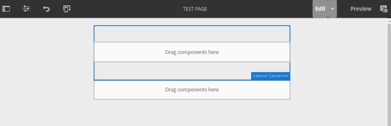
Add another Layout Container into container1
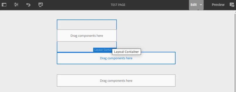
Add a Title into container2:
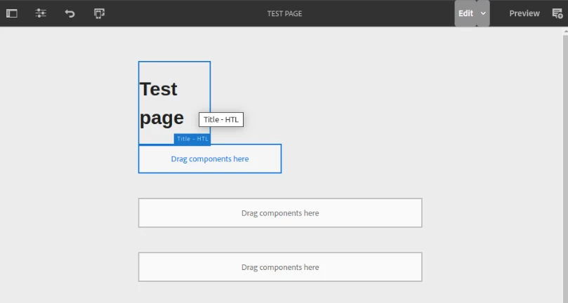
Result
With each successive level of nesting, the components occupy less and less width.
This seems to be caused by a bug whereby the AEM editor 'loses track' of the responsive width inheritance. Here is a table of expected vs actual behaviour:
| Container | cq:responsive | Expected | Actual |
| root | width=6 | 6 of 12 columns | 6 of 12 columns |
| container1 | none | 6 of 12 columns (inherited from parent) | 6 of 12 columns (inherited from parent) |
| container2 | none | 6 of 12 columns (inherited from parent) | 3 of 12 columns (inheritence is broken, container takes 6 of 6 of 12) instead |
Workarounds
There are 2 workarounds that authors can use to resolve the issue, but both are very time-consuming and prone to human error. As a result, this bug has a serious impact on the authoring UX and leads to many visual bugs on the website.
- Refresh the webpage with F5 after creating each component
- When placing a Layout Container, use the layout mode to manually resize to full width