Survey->Mobile Responsive | Community
Skip to main content
Anita_punmiya
Level 5
October 16, 2019

Survey->Mobile Responsive

  • October 16, 2019
  • 2 replies
  • 15607 views

Hi

I created a survey in Adobe Campaign and I am having trouble with the mobile rendering -> need it Mobile Responsive.

I tried below piece of code (shared in this forum for the similar issue) in my custom CSS but still no luck:

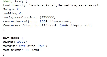
Please suggest what else I should add in my custom CSS to make it responsive on mobile?

Thanks,

Anita

This post is no longer active and is closed to new replies. Need help? Start a new post to ask your question.

2 replies

Jonathon_wodnicki
Community Advisor
Community Advisor
October 17, 2019

Hi,

Add this tag to <head/>:

<meta name="viewport" content="width=device-width, initial-scale=1.0">

You'll probably want some @media conditional blocks in the css too, depending on what the content's supposed to look like at different res. What is div.page?

Thanks,

-Jon

Anita_punmiya
Level 5
October 18, 2019

Thanks Jon for your response.

I have added the code you have shared but that also did not really help .

Here is the "div.page" :

Please let me know what should I add here?

Thanks,
Anita

somasundaram_h
Community Advisor
Community Advisor
October 21, 2019

Thank You somasundaramhaldurai​ .

I have already tried media query for some std screen sizes. But somehow the rendering is not consistent.

I will try modifying the code in CSS and see if it works.

Regards,
Anita


Share the URL if you don't mind. Will figure out and fix

Anita_punmiya
Level 5
October 21, 2019

Hi somasundaramhaldurai .

Thank you . I won't be able to share the URL but i will reach out if I still face any issues with the CSS.

Appreciate your help.

-Anita