Expand my Community achievements bar.

Latest Community Ideas Review is Out: Discover What’s New and What to Expect!

What is your workaround to have nice looking interface for capturing requests?

Avatar

Community Advisor

The current embedded forms look like this:
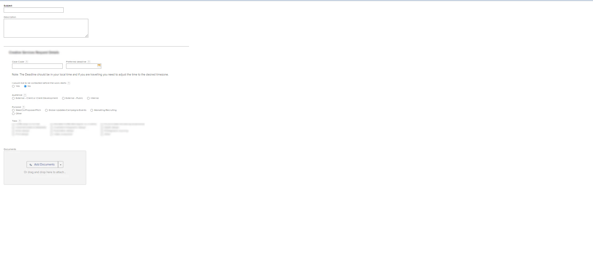
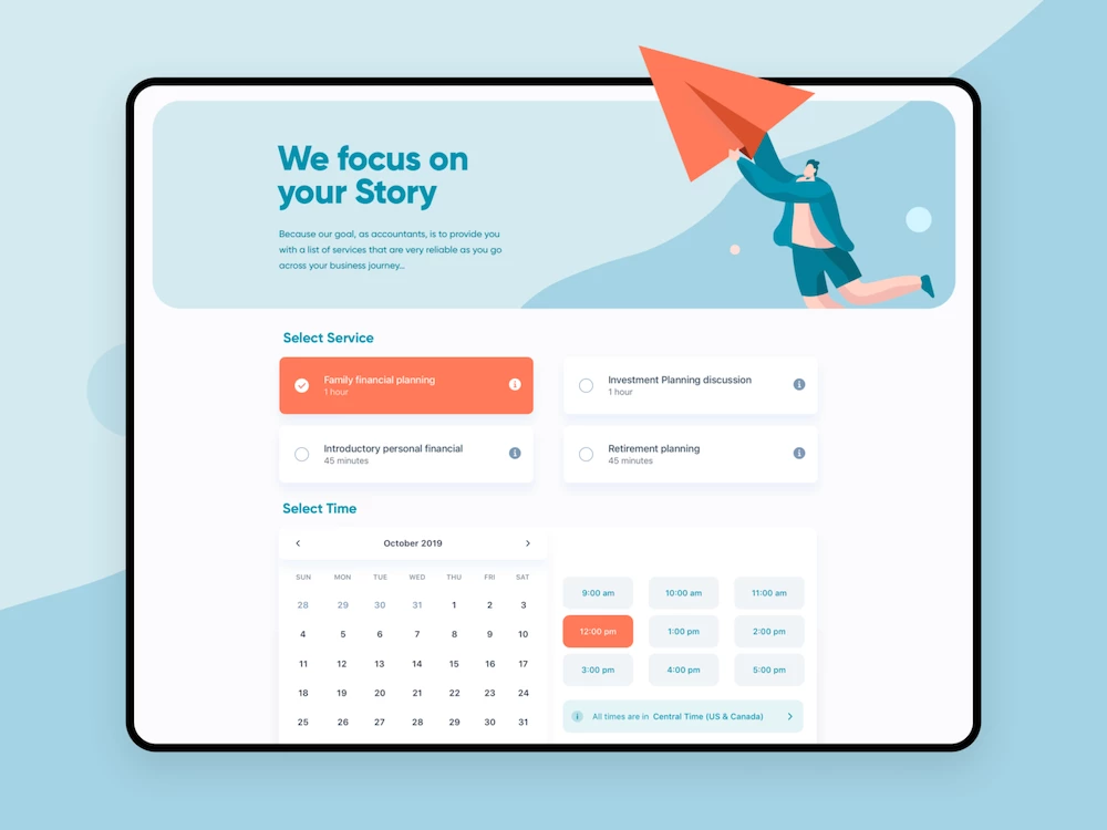
0694X00000EMsHPQA1.pngcompared to what moderd design has to offer, this looks poor.

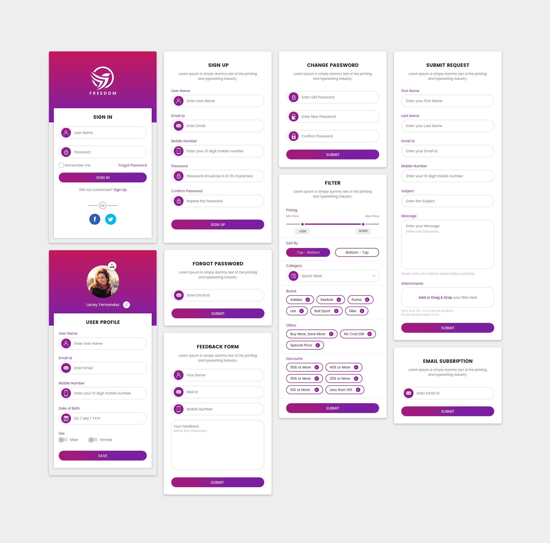
Examples0694X00000EMsHoQAL.png0694X00000EMsIDQA1.png
@workfront support any plan to make this look better?

Main pain points:

  • A lot of useless white space
  • everything left aligned
  • limited organization of fields (custom fields cannot be mixed with default fields)
  • lack of branding
  • lack of visual elemnts
  • outdated UI

https://one.workfront.com/s/idea/0874X000000oOFbQAM/detail

see my idea on this if you have similar thoughts.

Rafal

Topics

Topics help categorize Community content and increase your ability to discover relevant content.

48 Replies

Avatar

Level 2

Please add me as well if there is still room. Thank you!

Avatar

Level 1

@Gevorg Kazaryan‚ - I would love to be a part of the research/testing group if you still have room. Thanks!

Avatar

Employee

Hey @Alyson Hoover‚,

I'll definitely include you in the list and we will get in touch with you! As you see, a lot of people signed up for this and we will be contacting different groups in different stages of the research.

Looking forward to talking to you.

Avatar

Level 1

Does anyone know what happened to this? I see this was back in 2021.

Avatar

Community Advisor

I agree, the forms are frustrating as are the reports. It would be really nice if we could create our own style sheets.