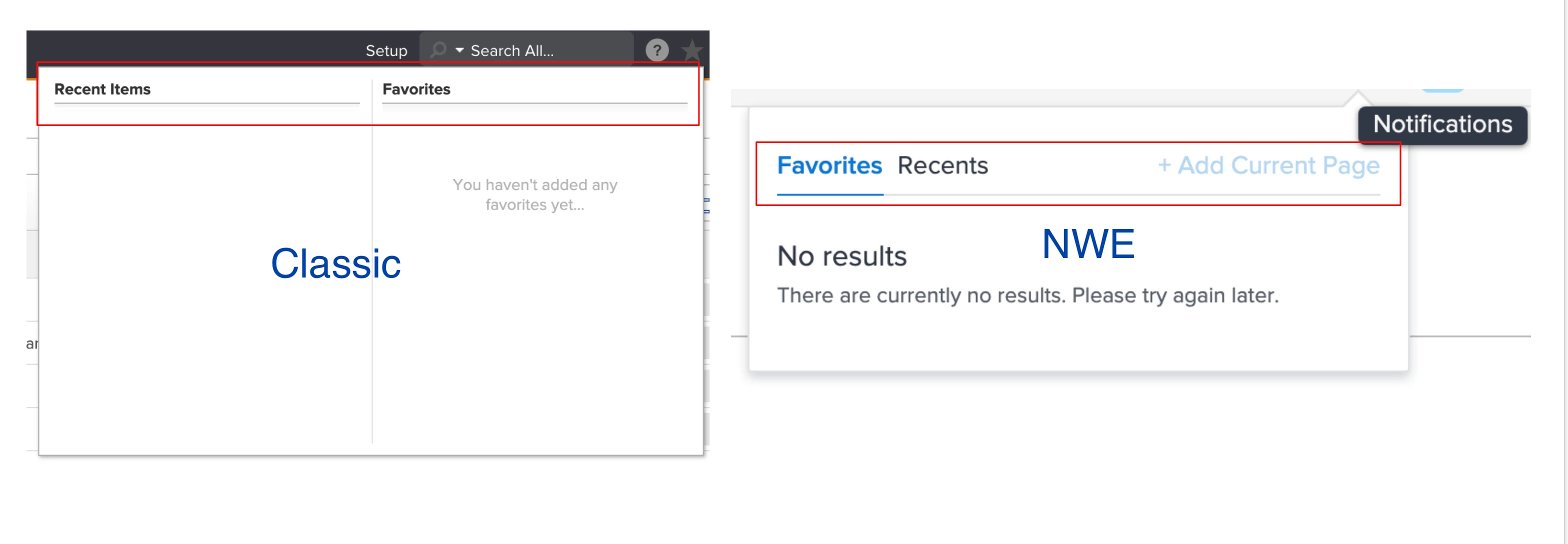
Should we keep it how it is in the new Workfront experience or switch it back to how it used to be in Classic?
In Classic, it was Recents and Favorites.
In the new Workfront experience, it is Favorites and Recents.
See image below for an example. Let me know what you think.
Topics help categorize Community content and increase your ability to discover relevant content.
Views
Replies
Total Likes
Is having them both available in a side-by-side view (like in Classic) an option? If yes, I'm indifferent on which is on the left. If that's not an option, I vote "Favorites" is the one that opens first (so on the left).
Yes, how you see it above is how it is laid out in the new Workfront experience, side-by-side with Favorites on the left and Recents on the right. Thanks for your feedback @Cathy Glenn‚.
Views
Replies
Total Likes
If we have to keep it as is where you have to switch between Recents and Favourites, I strongly suggest making Recents the primary choice when opening up the star. IMHO, and that of my users, Recents is the most useful navigation tool in the platform.
I suggest Recents and Favorites be decoupled: since the user knows which they are want before they start to navigate, a separate target button for each simplifies navigation to one (chosen) click.
And while we are spitballin’...it would be pretty slick if we could integrate Recents and Favorites into reports, first, as filters, but eventually, as a cross object concept for a broader view (eg ObjType, Name, Last Note, etc), @Matt Thomas‚ perhaps this could be a stretch objective for Reporting 2.0.
Regards,
Doug
Great feedback @John O'Sullivan‚ and @Doug Den Hoed‚, thank you both.
Views
Replies
Total Likes
Concur. Recents first. ~Jeff
I have no preference- but one thing that is slightly buggy is in Favorites Reports is 2nd on list, but in Recent reports are 4th..wish reports was higher at 2nd like in Favorites!
Interesting feedback @Sara Townsend‚, so perhaps being able to customize how/where the items appear within recs & favs... thanks.
Views
Replies
Total Likes
I agree with Sara. I don't have a preference which is first but do wish the lists were organized in the same order.
I don't really have a huge preference, although I do like the cleanliness of one column a bit better - but would NOT want both recents and favorites in the same column.
I do like that in NWE it opens to whatever I used last rather than ALWAYS opening to either Recents or to Favorites.
Makes sense @Heather Kulbacki‚ thanks for the feedback.
Views
Replies
Total Likes
I agree with Heather!
I prefer the new view of one column and having to switch.
I prefer the classic version or a default view option with NWE.
To make your life even more complicated @Jeremy Flores‚, I’d prefer the way it is in the NWE
Views
Replies
Total Likes
Ha, thanks @Manuel Bause‚ 😁
Views
Replies
Total Likes
My preference is to show Recents first. Most items that I "favorited" in the past are now pins for me, so I use the Recents tab far more frequently than the Favorites tab.
Me too!
While we're making wishes for Recents/Favorites...
I tend to Pin those things that I use ALL. THE. TIME. But I still Favorite those things that I use regularly and don't want to search for each time.
Recents makes sense to sort by whatever was most-recently used at the top. But it would be great if we could re-order things in our Favorites list. There are a few things that I have favorited that I use more frequently, but not enough to Pin them - each time I go to Favorites for those, I have to click the View More to get to them. If I could move them to the top of the list for that object type, that would be fabulous.
This has been frustrating for me as I will typically go to the recent tab before favorites and and am actually surprised it switched in the NWE.
Please switch it back to how it used to be in Classic.
Views
Likes
Replies
Views
Likes
Replies
Views
Likes
Replies
Views
Likes
Replies