Adobe Admin Console Support Portal: Don't hide ticket details.
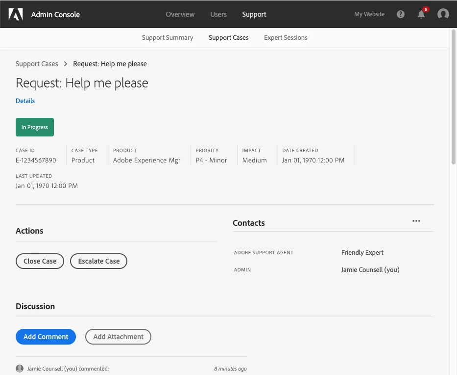
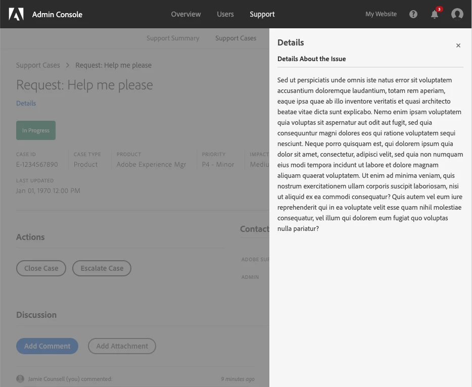
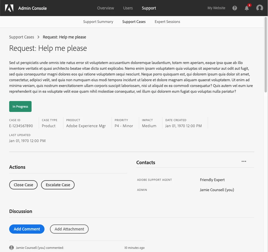
Some of our clients are now using the new Adobe Admin Console Support Portal. It's a huge improvement over Daycare, but there's one UI choice that I find quite strange. The details of each ticket are hidden in a sidebar. You click a link that says "Details" and it opens the details in a flyout sidebar. The initial ticket information is some of the most important info. Also, users are not always able to come up with a good name for a ticket, so sometimes the name alone does not help users differentiate tickets. Instead of having the "Details" link, I think the original ticket details should simply be placed right there in the page.
I've included a simple mockup of the change below:
Before (ticket page):

Before (flyout):

After (combined view):
