Design of the Add a Change section of the Publishing Tab
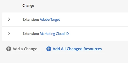
Can we talk about why the design to show items that are ready for a build changed so much between Launch and DTM?
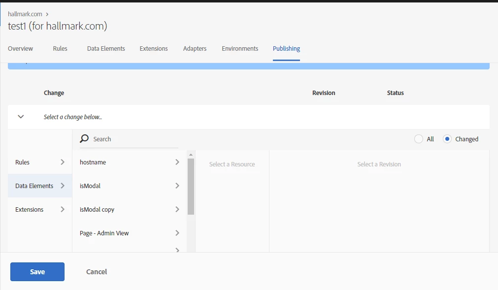
In Launch, I feel like it is Easter and I am trying to find all my candy. And I definitely have that feeling that there is candy I am missing in my hunt...so many rabbit holes to look down...and nobody likes this feeling! (screen shot 1).
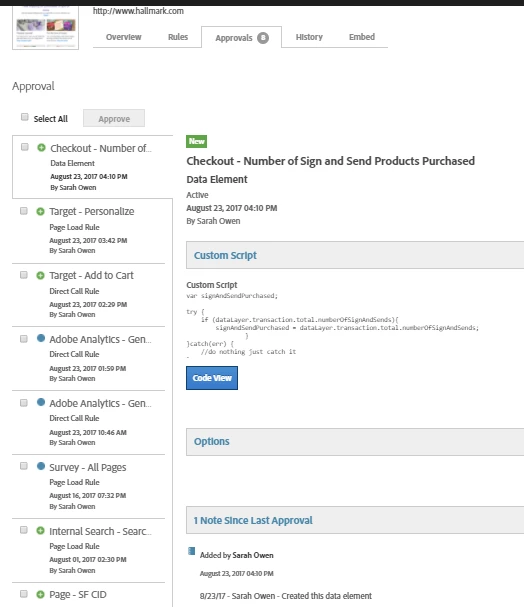
In DTM, I have a beautiful list of changes and I can easily go down the list and cherry pick the items that I want to include in the build (screen shot 2).
Screen Shot 1 :: Launch

Screen Shot 2 :: DTM

Thanks -
Sarah

