In Editable template, how to set different columns for different breakpoints in responsive grid | Community
Skip to main content
Level 4
January 11, 2021
Solved

In Editable template, how to set different columns for different breakpoints in responsive grid

  • January 11, 2021
  • 2 replies
  • 3107 views

Hi.

In the editable template, can we configure the Responsive grid (wcm/foundation/components/responsivegrid) to have different columns number in different breakpoints?. E.g. I'd liked to have 12 columns in desktop and tablet and (6 in mobile). I tried this, but it doesn’t work. I have done two things.

1.  I have modified grid.less file to set 6 as max-columns for mobile breakpoint and 12 as default for desktop/tablet.

2.  In the root layout container, under the policy, I have set the no. of columns as 12 (by default)

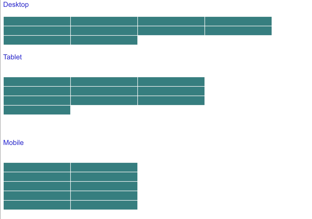
Under layout mode in the template, I can do resizing for desktop/tablet for 12 columns, but when I switch to mobile breakpoint it shows 12 columns instead of 6 columns. Secondly under layout mode, on the mobile breakpoint, when I resize, it doesn’t stay. It goes back to the default position.

I saw another similar post, but that doesn’t have the answer. So trying again with more details.

https://experienceleaguecommunities.adobe.com/t5/adobe-experience-manager/different-columns-count-for-different-breakpoints-in-responsive/qaq-p/270770/comment-id/52292

Thanks in advance.

This post is no longer active and is closed to new replies. Need help? Start a new post to ask your question.
Best answer by Umesh_Thakur

Hi @karanmahi,

I had similar kind of issue- to have different kind of layouts on desktop, tablet and mobile devices.  I handle it through simple css by generating the css class dynamically from the back end.

it was like:

Total Columns 10
Desktop Columns per row 4
Tablet Columns per row 3
Mobile Columns per row 2

Css class be :

<div class="col-lg__6-12 col-md__4-12 col-sm__4-12"></div>
 
device
  • desktop = lg
  • tablet = md
  • mobile = sm

Hope this will help.

Umesh Thakur

2 replies

Vijayalakshmi_S
Level 10
January 11, 2021

Hi @karanmahi,

Try with change that you have done for grid.less file alone. (Configuring different column number for different breakpoint) and remove the columns set by default at policy level (of layout container component)

Also, cross verify if the change done on "grid.less file" is available in the compiled ".css" file

karanmahiAuthor
Level 4
January 11, 2021
Hi @vijayalakshmi_s, if i do changes alone in grid.less alone and remove columns from policy , then layout resizing doesn't stay. It just goes back to default size. Basically, layout resizing doesn't work. And I have verified changes are there in compiles css file.
Umesh_Thakur
Community Advisor
Umesh_ThakurCommunity AdvisorAccepted solution
Community Advisor
January 12, 2021

Hi @karanmahi,

I had similar kind of issue- to have different kind of layouts on desktop, tablet and mobile devices.  I handle it through simple css by generating the css class dynamically from the back end.

it was like:

Total Columns 10
Desktop Columns per row 4
Tablet Columns per row 3
Mobile Columns per row 2

Css class be :

<div class="col-lg__6-12 col-md__4-12 col-sm__4-12"></div>
 
device
  • desktop = lg
  • tablet = md
  • mobile = sm

Hope this will help.

Umesh Thakur

karanmahiAuthor
Level 4
January 12, 2021
Hi @umesh_thakur - 1) How to apply these classes when i resize the layout ? Do i need to override any AEM code to apply our classes instead of default generated by AEM?I mean where should i put the css and backend so that it gets picked up while resizing?