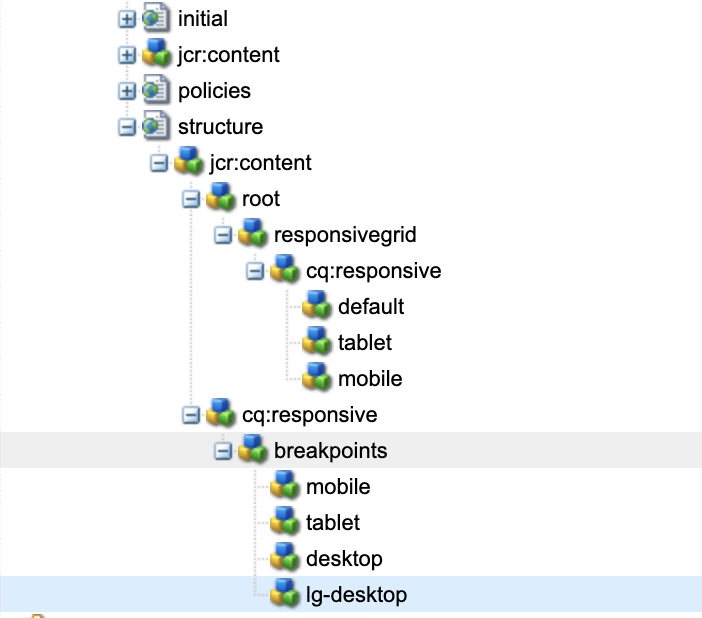
In AEM Editable template, Responsive authoring not working for custom breakpoints
We are on AEM 6.5.3 and working on setting up the responsive authoring for a desktop and large desktop. We did two things.
1. We have modified the grid.less for desktop and large desktop breakpoint. (code is below)
2. And added the respective breakpoint responsive node at the template for desktop and large desktop breakpoint.
But while doing responsive authoring, I can author only in the phone, tablet, and default mode.
Can anybody please provide any pointers to do responsive authoring for a desktop and large desktop?
below is the grid file, here you can see I have defined desktop and large desktop breakpoints. And I have the same nodes at the template.
@15844621 "/libs/wcm/foundation/clientlibs/grid/grid_base.less";
/* maximum amount of grid cells to be provided */
@max_col: 12;
/* default breakpoint */
.aem-Grid {
.generate-grid(default, @max_col);
width: auto;
}
/* phone breakpoint */
@590883 (max-width: 600px) {
.aem-Grid {
.generate-grid(phone, @max_col);
}
}
/* tablet breakpoint */
@590883 (min-width: 600px) and (max-width: 768px) {
.aem-Grid {
.generate-grid(tablet, @max_col);
}
}
/* small desktop breakpoint */
@590883 (min-width: 768px) and (max-width: 1024px) {
.aem-Grid {
.generate-grid(desktop, @max_col);
}
}
/* medium desktop breakpoint */
@590883 (min-width: 1024px) and (max-width: 1280px) {
.aem-Grid {
.generate-grid(lg-desktop, @max_col);
}
}
