How to configure component to use whole width of parent layout container | Community
Skip to main content
pieter-jand5817
May 22, 2018

How to configure component to use whole width of parent layout container

  • May 22, 2018
  • 2 replies
  • 3762 views

Our content editors are facing the following issue:

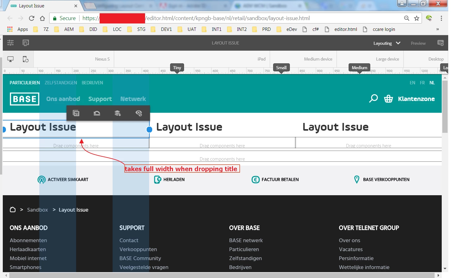
  1. they create a content page with 3 layout containers, each 4 columns wide, for the desktop variant. They drop in a title component and it takes the full width of the container
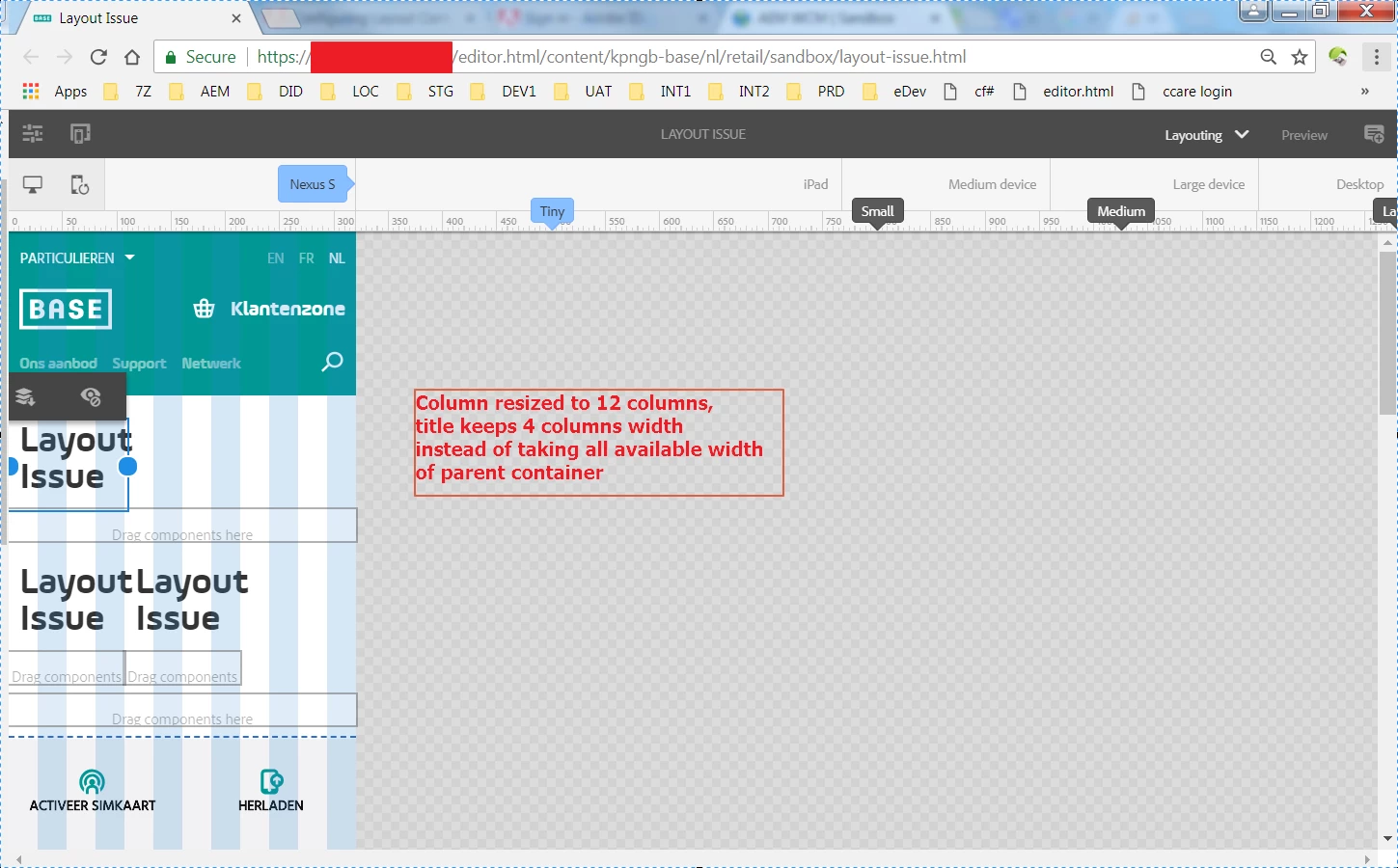
  2. Next they configure the layout for mobile devices. Each column is now the full 12 columns wide.

The issue is now that the title component is now still 4 columns wide, while the editors want the title component to use the whole width (so 12 columns) automatically. So they basically want to define the width of the title to 'take up all the available width as defined by the parent container'.

I've been wrapping my head around this for quite a while and haven't come up with a solution yet.

Looking forward for any suggestions!

Kind regards,

Pieter-Jan

This post is no longer active and is closed to new replies. Need help? Start a new post to ask your question.

2 replies

arunpatidar
Community Advisor
Community Advisor
May 22, 2018

Hi,

Can you please check your CSS, may be your custom CSS overriding the normal behaviuor.

you can do inspect elements and check the column and title components CSS rules.

Arun Patidar
pieter-jand5817
May 22, 2018

It seems the default aem grid css classes are assigned

What I forgot to mention are the values in crx/de: as you can see on the below screenshot, the tiny layout valuefor the width property is set to 4 columns wide, just as in the default node. I'll update the original question as well

Pieter-Jan

smacdonald2008
Level 10
May 22, 2018

As an AEM Dev - you can also create custom grid container via Bootstrap to get the flexibility that you want -- Creating a custom Touch UI Grid Component for Adobe Experience Manager

kautuk_sahni
Community Manager
Community Manager
May 23, 2018

When you change layout in Desktop mode and switch to mobile mode, then mobile mode would try to keep things similar to desktop mode. But you can change layout in mobile mode and when you resumes back to desktop mode, changes would persist.

So, to answer to your question on "editors want the title component to use the whole width (so 12 columns) automatically" I would say they have to edit this again on mobile mode then changes would persist.

-Kautuk

Kautuk Sahni
pieter-jand5817
May 24, 2018

Reading your response, makes it clear I haven't stated the problem properly.

Indeed, the authors can edit the page again for mobile and that is their current way of working. This is actually the step they want to avoid doing on all te pages. In their mind, the title component should take up all available width, no matter if the parent container is 4 or 12 columns wide.

So the question is: how to achieve this behaviour, while still developing components according to best practices of responsive component development in AEM.

Pieter-Jan

smacdonald2008
Level 10
May 24, 2018

If the parent layout - say a grid column is 4 wide - then the child component will be restricted to that width.