Hi @ksh_ingole7 ! Wow, do you really use JSP nowadays for your components? I don't think it is a best practice and the way Adobe recommends for extending Core components. We use JSP only for extending dialog Coral components' backend code. For anything else, all my peers stopped to use them once AEM 6.2 and the Core Components were presented back in 2017.
@sayali1 As for me, in your case the correct way of extending it would be updating the property imageDelegate in the parent .content.xml of your component from the default (core/wcm/components/image/v3/image) to another image component that will have the desired dialog & behavior you want. You can extend that new image component from the Core Image component (v3) or create a simplified new one.
Then, very likely, you will have to create the new Sling model for the new Teaser (extend from the v2/TeaserImpl using injection via resourceSuperType and a delegate pattern (@Delegate from Lombok the easiest way)) where you will cover the creating/using the image resource(s). Also, update the dialog for the new Image component + new Sling model for it to cover additional image source references in srcset (or in a new field) + rewrite its image.html to add media queries to the <img> tag or replace it with the <picture> tag with media queries and new sources.
After that, you can use this new image component everywhere on your project so all other images will have those new fields for mobile and tablet. We used this approach on many projects (only few of them were with Teaser components and imageDelegate though).
If you use Dynamic Media on your project, I anticipate there will be significantly more effort to reach what you want, but still achievable.
The Core components' code is written in a not very convenient way, not always with SOLID principles that hard to extend, and sometimes they have pesky out-of-the-box bugs that you are forced to deal with, but in general, they still can be extended, and used in production 😀 Also, they cover many other questions that may arise during the project lifetime that you don't aware of in the very beginning of a project 🙂
Don't forget to go through the AEM WKND tutorial and other resources like those ones provided by @shiv_prakash_patel if you are a novice in extending AEM components.
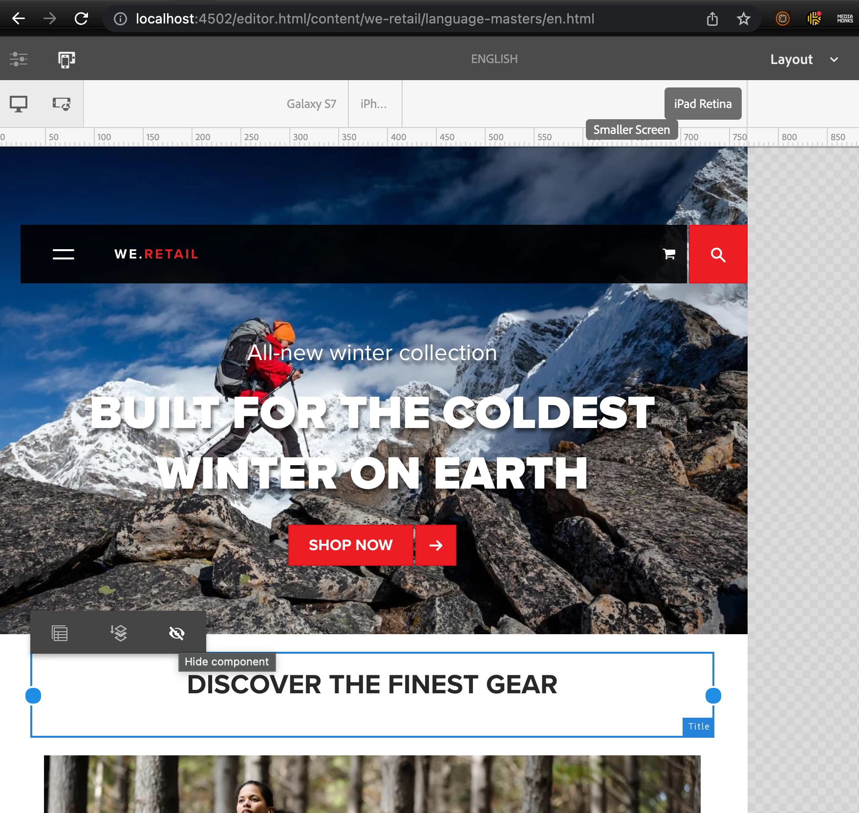
Update. Forgot to mention. The easiest way to author how it is necessary for you without even coding - placing three different versions of the Teaser component on a page with the default AEM Grid style, then using the default "Layout" page editing mode and the "Hide Component" button to hide teasers that should not be displayed for the selected screen width.