Conditionally displaying a field in dialog based on select value | Community
Skip to main content
Level 4
June 28, 2024
Solved

Conditionally displaying a field in dialog based on select value

  • June 28, 2024
  • 3 replies
  • 1211 views

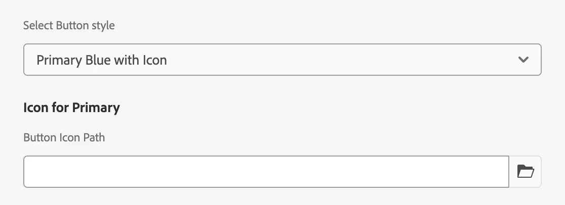
We have a select in our dialog with several options to select button style. One of the button styles includes adding an icon into the button. If the icon option is selected, we need a pathfield to appear. How can we accomplish that? Here is what I've tried so far. The following is the select with the options:
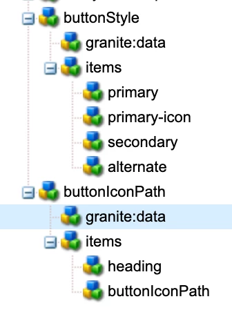
<buttonStyle
    jcr:primaryType="cq:WidgetCollection"
    sling:resourceType="granite/ui/components/coral/foundation/form/select"
    defaultValue="primary"
    fieldDescription="Buttle style"
    fieldLabel="Select button style"
    name="./buttonStyle">
    <granite:data
        jcr:primaryType="nt:unstructured"
        cq-dialog-dropdown-showhide-target=".buttonStyle-showhide-target"/>
    <items jcr:primaryType="nt:unstructured">
        <primary
            jcr:primaryType="nt:unstructured"
            text="Primary Blue"
            value="primary"/>
        <primary-icon
            jcr:primaryType="nt:unstructured"
            text="Primary Blue with Icon"
            value="primary-icon"/>
        <primary-small
            jcr:primaryType="nt:unstructured"
            text="Secondary Blue"
            value="secondary"/>
        <secondary-large
            jcr:primaryType="nt:unstructured"
            text="Alternate Gray"
            value="alternate"/>
    </items>
</buttonStyle>

When "Primary Blue with Icon" is selected, we need the following pathfield to appear. When "Primary Blue with Icon" is not selected, the following pathfield should not appear:

 
<buttonIconPath
    jcr:primaryType="nt:unstructured"
    sling:resourceType="granite/ui/components/coral/foundation/form/pathfield"
    fieldLabel="Button Icon Path"
    name="./buttonIconPath"
    rootPath="/content/dam/">
    <granite:rendercondition
        jcr:primaryType="nt:unstructured"
        sling:resourceType="granite/ui/components/coral/foundation/renderconditions/simple"
        expression="${granite:resourceValue('buttonStyle') == 'primary-icon'}"/>
</ctaIconPath>
This post is no longer active and is closed to new replies. Need help? Start a new post to ask your question.
Best answer by sarav_prakash

You dont need granite:rendercondition. This is simple usecase you can achieve with showhide-target only. This is your dialog fields


<buttonStyle granite:class="cq-dialog-dropdown-showhide" jcr:primaryType="nt:unstructured" sling:resourceType="granite/ui/components/coral/foundation/form/select" fieldLabel="Select Button style" name="./buttonStyle"> <granite:data jcr:primaryType="nt:unstructured" cq-dialog-dropdown-showhide-target=".list-option-buttonstyle-showhide-target"/> <items jcr:primaryType="nt:unstructured"> <primary jcr:primaryType="nt:unstructured" text="Primary Blue" value="primary"/> <primary-icon jcr:primaryType="nt:unstructured" text="Primary Blue with Icon" value="primaryicon"/> <secondary jcr:primaryType="nt:unstructured" text="Secondary Blue" value="secondary"/> <alternate jcr:primaryType="nt:unstructured" text="Alternate Gray" value="alternate"/> </items> </buttonStyle> <buttonIconPath granite:class="hide list-option-buttonstyle-showhide-target foundation-layout-util-vmargin" jcr:primaryType="nt:unstructured" sling:resourceType="granite/ui/components/coral/foundation/container"> <granite:data jcr:primaryType="nt:unstructured" showhidetargetvalue="primaryicon"/> <items jcr:primaryType="nt:unstructured"> <heading granite:class="coral-Heading coral-Heading--4" jcr:primaryType="nt:unstructured" sling:resourceType="granite/ui/components/coral/foundation/heading" level="{Long}4" text="Icon for Primary"/> <buttonIconPath jcr:primaryType="nt:unstructured" sling:resourceType="granite/ui/components/coral/foundation/form/pathfield" fieldLabel="Button Icon Path" name="./buttonIconPath"/> </items> </buttonIconPath>


Your dialog nodes will look like this 

And on the component dialog, it ll look like this 

The `Button Icon Path` will show only for Primary Blue with Icon option and will hide for remaining options. 


Hope this helps you. 


3 replies

gkalyan
Community Advisor and Adobe Champion
June 28, 2024

Hi @codelime 


Check out this blog, which illustrates your use case.

Show/Hide cq-dialog Fields based on Drop-Down Selection in AEM - https://experienceleaguecommunities.adobe.com/t5/adobe-experience-manager-blogs/show-hide-cq-dialog-fields-based-on-drop-down-selection-in-aem/ba-p/563950

sarav_prakash
Community Advisor
sarav_prakashCommunity AdvisorAccepted solution
Community Advisor
June 28, 2024

You dont need granite:rendercondition. This is simple usecase you can achieve with showhide-target only. This is your dialog fields


<buttonStyle granite:class="cq-dialog-dropdown-showhide" jcr:primaryType="nt:unstructured" sling:resourceType="granite/ui/components/coral/foundation/form/select" fieldLabel="Select Button style" name="./buttonStyle"> <granite:data jcr:primaryType="nt:unstructured" cq-dialog-dropdown-showhide-target=".list-option-buttonstyle-showhide-target"/> <items jcr:primaryType="nt:unstructured"> <primary jcr:primaryType="nt:unstructured" text="Primary Blue" value="primary"/> <primary-icon jcr:primaryType="nt:unstructured" text="Primary Blue with Icon" value="primaryicon"/> <secondary jcr:primaryType="nt:unstructured" text="Secondary Blue" value="secondary"/> <alternate jcr:primaryType="nt:unstructured" text="Alternate Gray" value="alternate"/> </items> </buttonStyle> <buttonIconPath granite:class="hide list-option-buttonstyle-showhide-target foundation-layout-util-vmargin" jcr:primaryType="nt:unstructured" sling:resourceType="granite/ui/components/coral/foundation/container"> <granite:data jcr:primaryType="nt:unstructured" showhidetargetvalue="primaryicon"/> <items jcr:primaryType="nt:unstructured"> <heading granite:class="coral-Heading coral-Heading--4" jcr:primaryType="nt:unstructured" sling:resourceType="granite/ui/components/coral/foundation/heading" level="{Long}4" text="Icon for Primary"/> <buttonIconPath jcr:primaryType="nt:unstructured" sling:resourceType="granite/ui/components/coral/foundation/form/pathfield" fieldLabel="Button Icon Path" name="./buttonIconPath"/> </items> </buttonIconPath>


Your dialog nodes will look like this 

And on the component dialog, it ll look like this 

The `Button Icon Path` will show only for Primary Blue with Icon option and will hide for remaining options. 


Hope this helps you. 


pulkitvashisth
Community Advisor
Community Advisor
July 1, 2024

Hi @codelime 
The blog link provided by @gkalyan is apt and you can have a look.
As per your code above you can make the following changes : 

<buttonStyle>
<items>...</items>
<granite:data jcr:primaryType="nt:unstructured"
cq-dialog-dropdown-showhide-target=".buttonStyle-showhide-target"/>
</buttonStyle
>


and then:

<container
granite:class="buttonStyle-showhide-target"
jcr:primaryType="nt:unstructured"
sling:resourceType="granite/ui/components/coral/foundation/container">
<buttonI
conPath
    jcr:primaryType="nt:unstructured"
    sling:resourceType="granite/ui/components/coral/foundation/form/pathfield"
    fieldLabel="Button Icon Path"
    name="./buttonIconPath"
    rootPath="/content/dam/">
    <granite:data
jcr:primaryType="nt:unstructured"
showhidetargetvalue="primary-icon"/>

</buttonIconPath>
</container>


this should work

CodelimeAuthor
Level 4
July 2, 2024
<multiCtaStyle jcr:primaryType="nt:unstructured" sling:resourceType="granite/ui/components/foundation/form/select" class="cq-dialog-dropdown-showhide" cq-dialog-dropdown-showhide-target=".test-options-showhide-target" fieldLabel="CTA Style" name="./multiCtaStyle"> <items jcr:primaryType="nt:unstructured"> <primary-large jcr:primaryType="nt:unstructured" text="Primary Large" value="btn-primary"/> <primary-large-icon jcr:primaryType="nt:unstructured" text="Primary Large with Icon" value="btn-primary btn-primary-icon"/> <primary-small jcr:primaryType="nt:unstructured" text="Primary Small" value="btn-primary btn-small"/> <secondary-large jcr:primaryType="nt:unstructured" text="Secondary Large" value="btn-secondary"/> <secondary-small jcr:primaryType="nt:unstructured" text="Secondary Small" value="btn-secondary btn-small"/> <text-link jcr:primaryType="nt:unstructured" text="Text Link" value="primary-cta"/> </items> </multiCtaStyle> <ctaIconPath jcr:primaryType="nt:unstructured" sling:resourceType="granite/ui/components/foundation/container" class="hide test-options-showhide-target foundation-layout-util-vmargin" showhidetargetvalue="btn-primary btn-primary-icon"> <items jcr:primaryType="nt:unstructured"> <well jcr:primaryType="nt:unstructured" sling:resourceType="granite/ui/components/foundation/container"> <layout jcr:primaryType="nt:unstructured" sling:resourceType="granite/ui/components/foundation/layouts/well"/> <items jcr:primaryType="nt:unstructured"> <ctaIconPath jcr:primaryType="nt:unstructured" sling:resourceType="granite/ui/components/coral/foundation/form/pathfield" fieldLabel="CTA Button Icon Path" name="./ctaIconPath" rootPath="/content/dam/images"/> </items> </well> </items> </ctaIconPath>

@pulkitvashisth - I tried your approach but have something wrong apparently. I worked on it and have it now almost working. The only remaining issue is that the field, which should be hidden until "Primary Large with Icon" is selected, is not hidden when you first access the dialog. However, making other selections successfully hides it. How can I hide it by default, and only display it when "Primary Large with Icon" is selected?


pulkitvashisth
Community Advisor
Community Advisor
July 3, 2024

In you ctaIconPath container parallel to items node add the
granite:data node and it should work fine (remove showhidetargetvalue prop from ctaIconPath)
<ctaIconPath>
      <items></items>
      <granite:data jcr:primaryType="nt:unstructured"
         showhidetargetvalue="btn-primary btn-primary-icon"/>
</ctaIconPath>

Let me know if this doesn't work