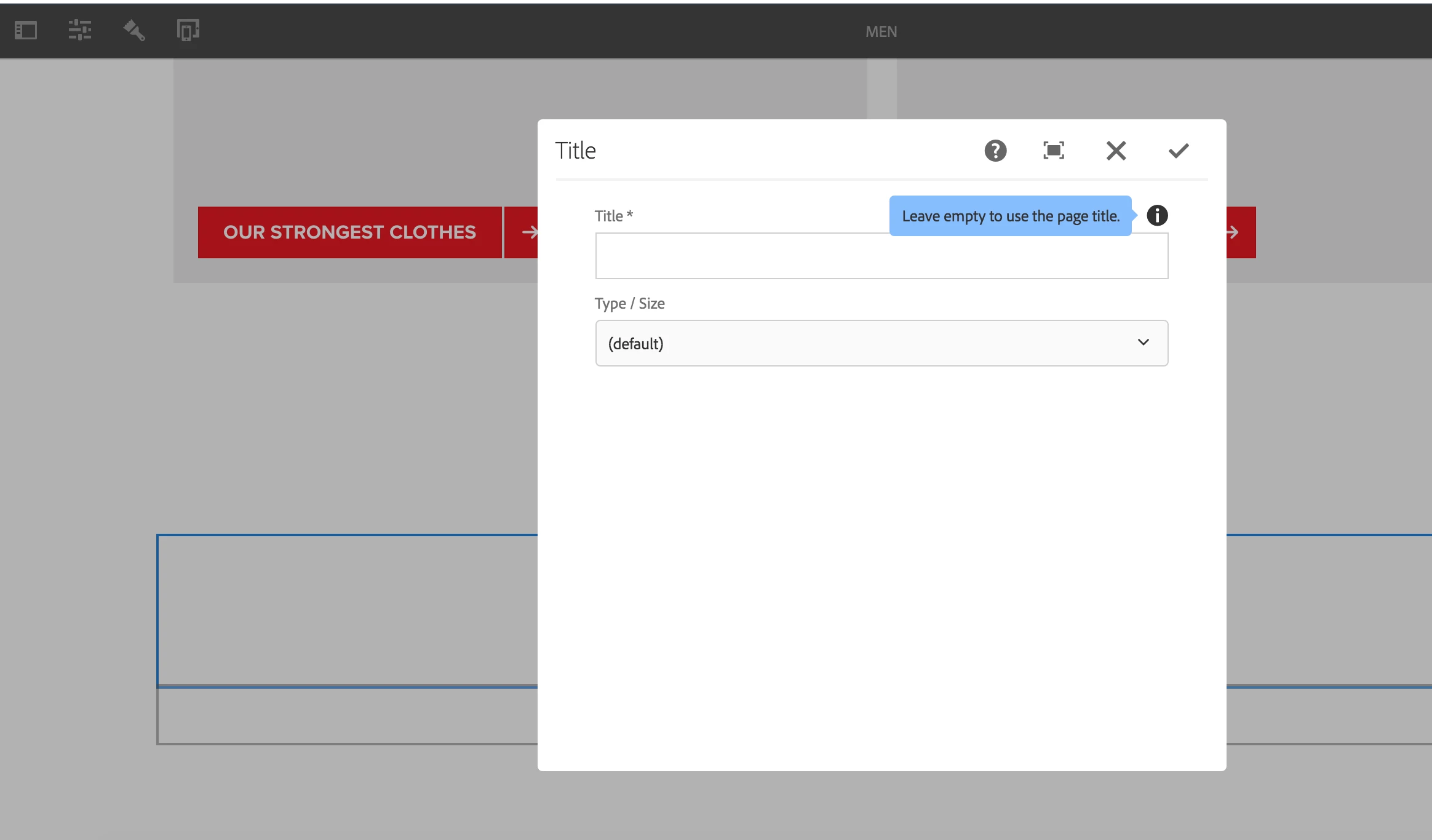
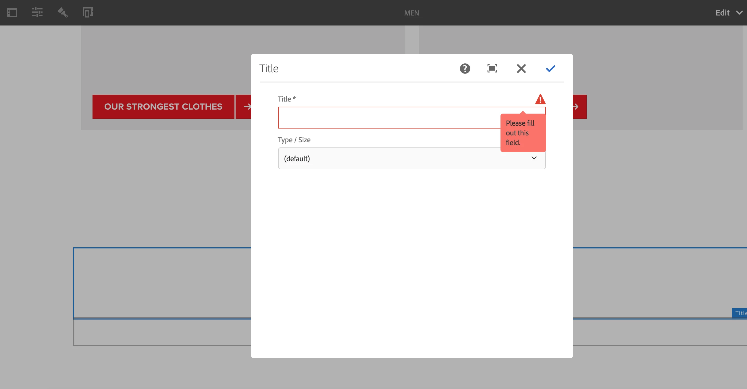
AEM touch ui dialog 6.3 - Validation Error Icon is overlapping Description icon
I have a title component(touch-ui) in my project and made the title field mandatory by setting required(boolean) – true at the title property level. Now, when we save the dialog with an empty title field, validation fires up, but the triangular icon overlaps the description icon in the component. See screenshots below. Is there any way to resolve this?
Seeing the same behavior in We.retail title component.