AEM React SPA retina image with srcset showing large from the original image | Community
Skip to main content
sayed021
January 26, 2024
Solved

AEM React SPA retina image with srcset showing large from the original image

  • January 26, 2024
  • 2 replies
  • 1008 views

I am currently encountering an issue within Adobe Experience Manager (AEM) where implementing the Retina support feature through the 'srcset' attribute within the Image component results in slightly larger image displays. This discrepancy is particularly noticeable when working with images of smaller or medium sizes. Could you please provide guidance or assistance in resolving this matter?


Code Example:

<img src="/.../gb/demo/_jcr_content/root/responsivegrid/image.coreimg.png/1706262655053/flag-of-belgium.svg.png" alt="sgvd" srcset="/.../gb/demo/_jcr_content/root/responsivegrid/image.coreimg.82.375.png/1706262655053/flag-of-belgium.svg.png 375w,/.../gb/demo/_jcr_content/root/responsivegrid/image.coreimg.82.768.png/1706262655053/flag-of-belgium.svg.png 768w,/.../gb/demo/_jcr_content/root/responsivegrid/image.coreimg.82.1200.png/1706262655053/flag-of-belgium.svg.png 1200w">


Problem Screenshot:


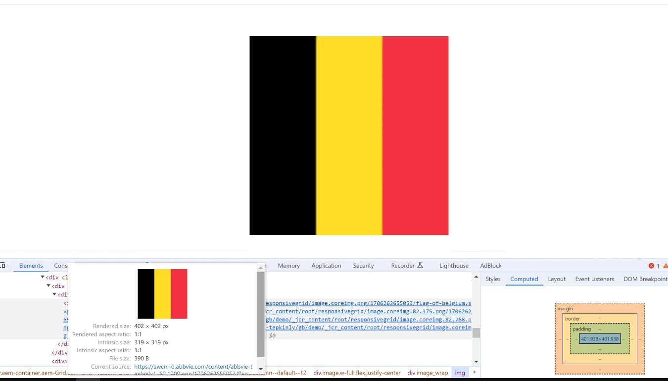
In this image, the original image is 319 X 319 but the browser renders it 402 X 402, this problem happens on small or medium size images. How can I solve this problem it will show a large screen maximum like the original size and the lower screen will be a resized small image. 


how can I achieve this any ideas or suggestions please write in the comment box.


Thanks, in advance. 

This post is no longer active and is closed to new replies. Need help? Start a new post to ask your question.
Best answer by EstebanBustamante

Hi, 


Retina screens are known for having a higher pixel density compared to standard displays. To provide a sharper and clearer image on Retina screens, websites often serve images at a higher resolution. This means that Retina screens may request images that have more pixels per inch (PPI) or are at a larger physical size compared to standard screens. This is commonly achieved through the use of the srcset attribute in HTML, where different image sizes are provided, and the browser can choose the appropriate size based on the device's display characteristics, such as screen resolution. So, it is expected that they may not necessarily pick up the smaller rendition on your small device. However, according to this documentation https://experienceleague.adobe.com/docs/experience-manager-core-components/using/developing/adaptive-image-servlet.html?lang=en#rendition-selection, the image should not scale the original rendition if the resolution of the rendition is suitable.


I suggest checking a couple of things

1) The renditions are correctly generated

2) The component is correctly registered with the Adaptive Image Servlet, alternatively, you can try with the ootb core image component

Here is a link where you can find more about how the rendition resolution works: https://github.com/adobe/aem-core-wcm-components/wiki/The-Adaptive-Image-Servlet  https://github.com/adobe/aem-core-wcm-components/blob/main/bundles/core/src/main/java/com/adobe/cq/wcm/core/components/internal/servlets/AdaptiveImageServlet.java 


Hope this helps

2 replies

EstebanBustamante
Community Advisor and Adobe Champion
EstebanBustamanteCommunity Advisor and Adobe ChampionAccepted solution
Community Advisor and Adobe Champion
January 26, 2024

Hi, 


Retina screens are known for having a higher pixel density compared to standard displays. To provide a sharper and clearer image on Retina screens, websites often serve images at a higher resolution. This means that Retina screens may request images that have more pixels per inch (PPI) or are at a larger physical size compared to standard screens. This is commonly achieved through the use of the srcset attribute in HTML, where different image sizes are provided, and the browser can choose the appropriate size based on the device's display characteristics, such as screen resolution. So, it is expected that they may not necessarily pick up the smaller rendition on your small device. However, according to this documentation https://experienceleague.adobe.com/docs/experience-manager-core-components/using/developing/adaptive-image-servlet.html?lang=en#rendition-selection, the image should not scale the original rendition if the resolution of the rendition is suitable.


I suggest checking a couple of things

1) The renditions are correctly generated

2) The component is correctly registered with the Adaptive Image Servlet, alternatively, you can try with the ootb core image component

Here is a link where you can find more about how the rendition resolution works: https://github.com/adobe/aem-core-wcm-components/wiki/The-Adaptive-Image-Servlet  https://github.com/adobe/aem-core-wcm-components/blob/main/bundles/core/src/main/java/com/adobe/cq/wcm/core/components/internal/servlets/AdaptiveImageServlet.java 


Hope this helps

Esteban Bustamante
kautuk_sahni
Community Manager
Community Manager
January 30, 2024

@sayed021 Did you find the suggestions from users helpful? Please let us know if more information is required. Otherwise, please mark the answer as correct for posterity. If you have found out solution yourself, please share it with the community.

Kautuk Sahni