AEM 6.3 Style sytem - Not able to view styles tab & Policy icon in component policy | Community
Skip to main content
Level 3
August 22, 2018
Solved

AEM 6.3 Style sytem - Not able to view styles tab & Policy icon in component policy

  • August 22, 2018
  • 1 reply
  • 3029 views

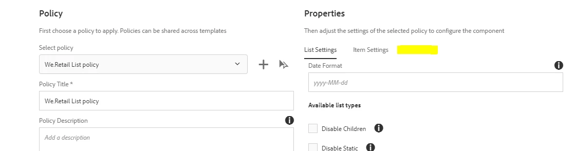
We have followed the link Style System  for including style system. But when we click on the policy tab of the List component we are not able to view styles tab as mentioned in the blog.

But in the blog they mentioned as

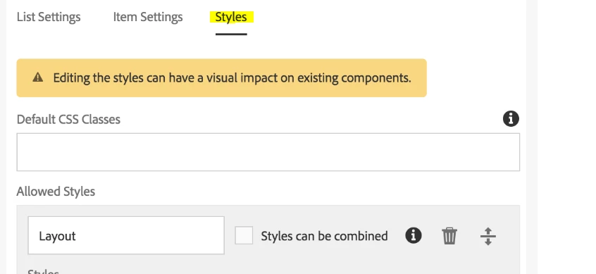
Do we need to enable anything for the styles tab to appear.

And also for the project related components we are not able to see the policy icon

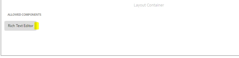
Can you please suggest why we are not able to see the styles tab in the policy & policy icon in the allowed components.

Thanks & Regards,
Kalyani

This post is no longer active and is closed to new replies. Need help? Start a new post to ask your question.
Best answer by arunpatidar

Hi,

Yes, you need to setup.

Setup

Note:

Version 2 of the core components is fully enabled to take advantage of the style system and requires no additional configuration.

Follow the next steps to enable the style system for your own custom components or to extend the version 1 core components to utilize the feature.

In order for a component to work with AEM's style system and show the style tab in its design dialog, the component developer must include that tab from the product with the following settings on the component:

  • path = "/mnt/overlay/cq/gui/components/authoring/dialog/style/tab_design/styletab"
  • sling:resourceType = "granite/ui/components/coral/foundation/include"

With the component configured, the styles configured by the page authors will be automatically inserted by AEM on the decoration element that AEM automatically wraps around every editable component. The component itself need not do anything else to make this happen.

1 reply

arunpatidar
Community Advisor
arunpatidarCommunity AdvisorAccepted solution
Community Advisor
August 22, 2018

Hi,

Yes, you need to setup.

Setup

Note:

Version 2 of the core components is fully enabled to take advantage of the style system and requires no additional configuration.

Follow the next steps to enable the style system for your own custom components or to extend the version 1 core components to utilize the feature.

In order for a component to work with AEM's style system and show the style tab in its design dialog, the component developer must include that tab from the product with the following settings on the component:

  • path = "/mnt/overlay/cq/gui/components/authoring/dialog/style/tab_design/styletab"
  • sling:resourceType = "granite/ui/components/coral/foundation/include"

With the component configured, the styles configured by the page authors will be automatically inserted by AEM on the decoration element that AEM automatically wraps around every editable component. The component itself need not do anything else to make this happen.

Arun Patidar