Remove circles from line charts
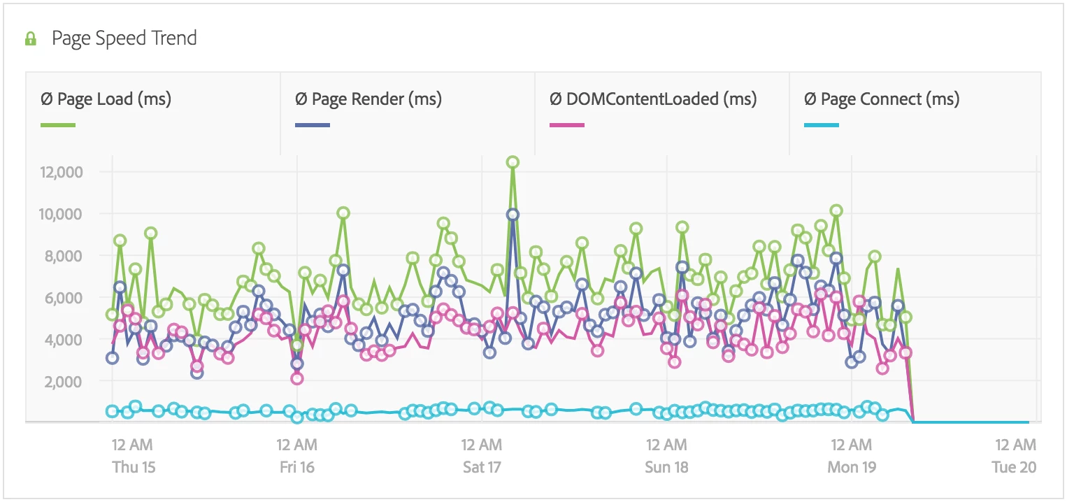
Since the February release of Adobe Analytics workspace, line charts have little circles around many data points, even when Show Anomalies has been turned off.
The circles obscure the data, and make it harder for the readers to view the trend.

Is there an option to turn the circles off somehow? If I hover my mouse cursor over the data table, then the circles are hidden, but this is not very user friendly.