Webinar: Adobe Customer Journey Analytics Product Innovations: A Quarterly Overview. Come learn for the Adobe Analytics Product team who will be covering AJO reporting, Graph-based Stitching, guided analysis for CJA, and more!
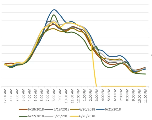
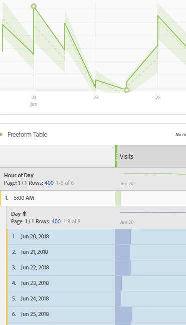
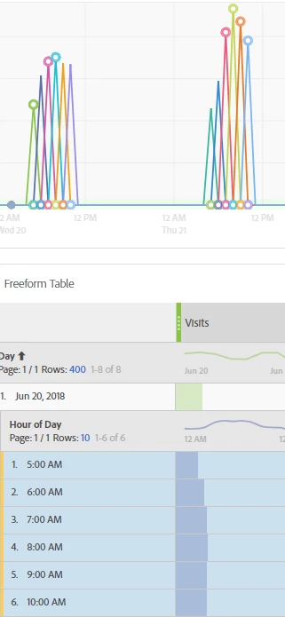
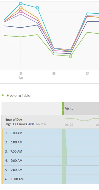
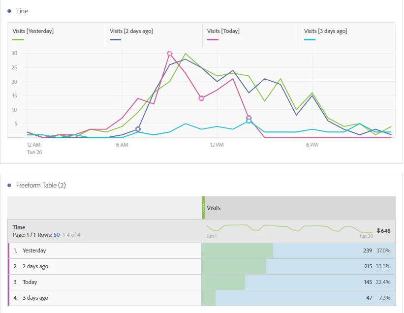
I'd like to make a line chart with the x axis consisting of hours of the day, and each line on the chart a different day. The Y axis would obviously be a variable metric. How can I accomplish this? See Excel chart for what I'd like, and a few screenshots of workspace projects that have failed - the x axis is always a date. I'd settle for a bar chart if that's what I can get, but line chart would be best. Thanks!
First create Date Ranges (the purple components) for each of the days you want to compare in your chart. Then create a table with the new Date Ranges and your metric. Then highlight the cells, right click and visualize.