Creating an index chart | Community
Skip to main content
November 9, 2018
Solved

Creating an index chart

  • November 9, 2018
  • 2 replies
  • 1981 views

Hi, I'm trying to make an index chart based on the percentages from a Freeform table:
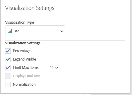
The equivalent in Excel would be a case of just changing the axis value of the y-axis to 1 (or 100%) on the bar graph, and bang, you've got yourself an index chart.  How do you do the same in Adobe Workspace?

Thanks for your help!

This post is no longer active and is closed to new replies. Need help? Start a new post to ask your question.
Best answer by EricMatisoff

I think this is the visualization you are looking for? My apologies if I'm wrong - been a minute since I've bar graphed in Excel

100% Stacked Visualizations in Analysis Workspace - YouTube

2 replies

EricMatisoff
Adobe Employee
EricMatisoffAdobe EmployeeAccepted solution
Adobe Employee
January 16, 2019

I think this is the visualization you are looking for? My apologies if I'm wrong - been a minute since I've bar graphed in Excel

100% Stacked Visualizations in Analysis Workspace - YouTube

Gigazelle
Adobe Employee
Adobe Employee
January 30, 2019

Hi Joe, was Eric's answer what you were after?