Expand my Community achievements bar.

Join us January 15th for an AMA with Champion Achaia Walton, who will be talking about her article on Event-Based Reporting and Measuring Content Groups!
SOLVED

Bar chart granuality configuration

Avatar

Level 2

Hello everyone in the community.

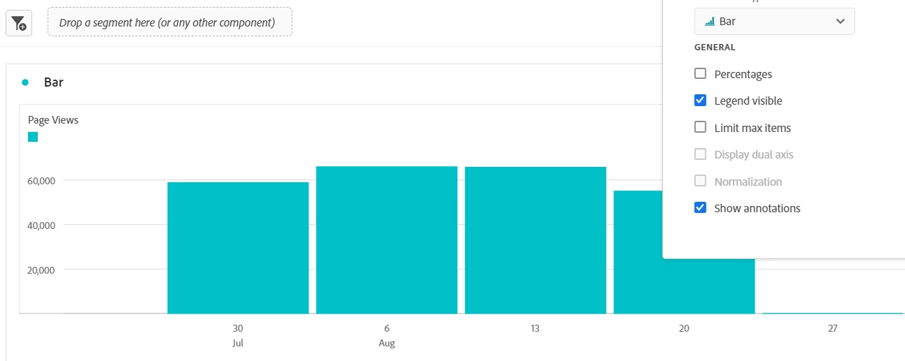
As I can see, the granuality filter is visible for line charts in the configuration options but is not for bar charts.

Is there any method to modify the granularity of a bar chart without changing the data source (freeform table data)
Monishas1_2-1692954867890.png

1 Accepted Solution

Avatar

Correct answer by
Community Advisor and Adobe Champion

Another option is to have another freeform table driving the visualization (but hiding it)


So that you can have your visible freeform data at one granularity, and your visualization (attached to a separate invisible data source) at a different granularity.


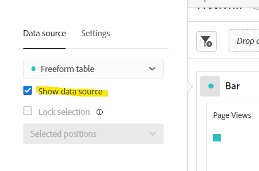
To hide a freeform table, if you click on the coloured dot on the visualization, you can un-check "Show data source"


Jennifer_Dungan_0-1692978149487.png


View solution in original post

2 Replies

Avatar

Level 5

Hi @Monishasargunan 


Bar Chart Granuality Configuration:


If you want to modify the granularity of a bar chart without changing the data source in Adobe Analytics, you typically need to manipulate the way the data is presented or aggregated in the chart settings. Here is what  you can consider:


  1. Dimension Grouping: For non-time dimensions, you might be able to group or categorize data to change the granularity. For instance, if you have a dimension like "Product Category," you could group similar products together to show data at a higher level.
  2. Date Ranges: If your data involves time-based metrics, you can often adjust the date range displayed on the chart. This effectively changes the granularity by showing data over different time spans.
  3. Custom Calculations: Adobe Analytics allows you to create custom calculations or metrics. You might be able to create calculated metrics that aggregate or categorize data differently, effectively changing the granularity.

Avatar

Correct answer by
Community Advisor and Adobe Champion

Another option is to have another freeform table driving the visualization (but hiding it)


So that you can have your visible freeform data at one granularity, and your visualization (attached to a separate invisible data source) at a different granularity.


To hide a freeform table, if you click on the coloured dot on the visualization, you can un-check "Show data source"


Jennifer_Dungan_0-1692978149487.png