Solved
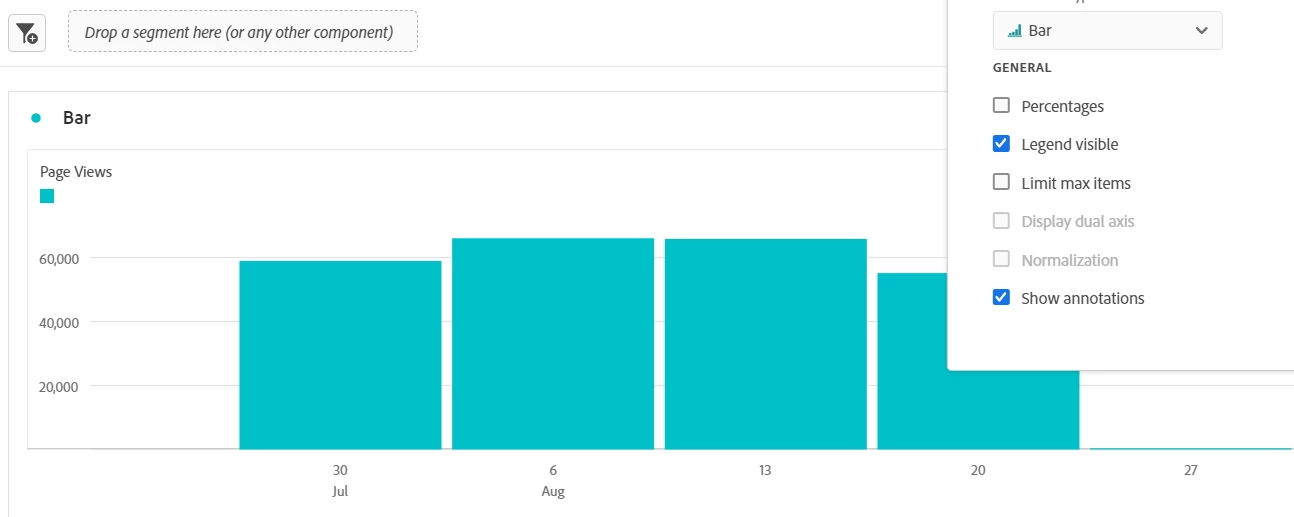
Bar chart granuality configuration
Hello everyone in the community.
As I can see, the granuality filter is visible for line charts in the configuration options but is not for bar charts.
Is there any method to modify the granularity of a bar chart without changing the data source (freeform table data)