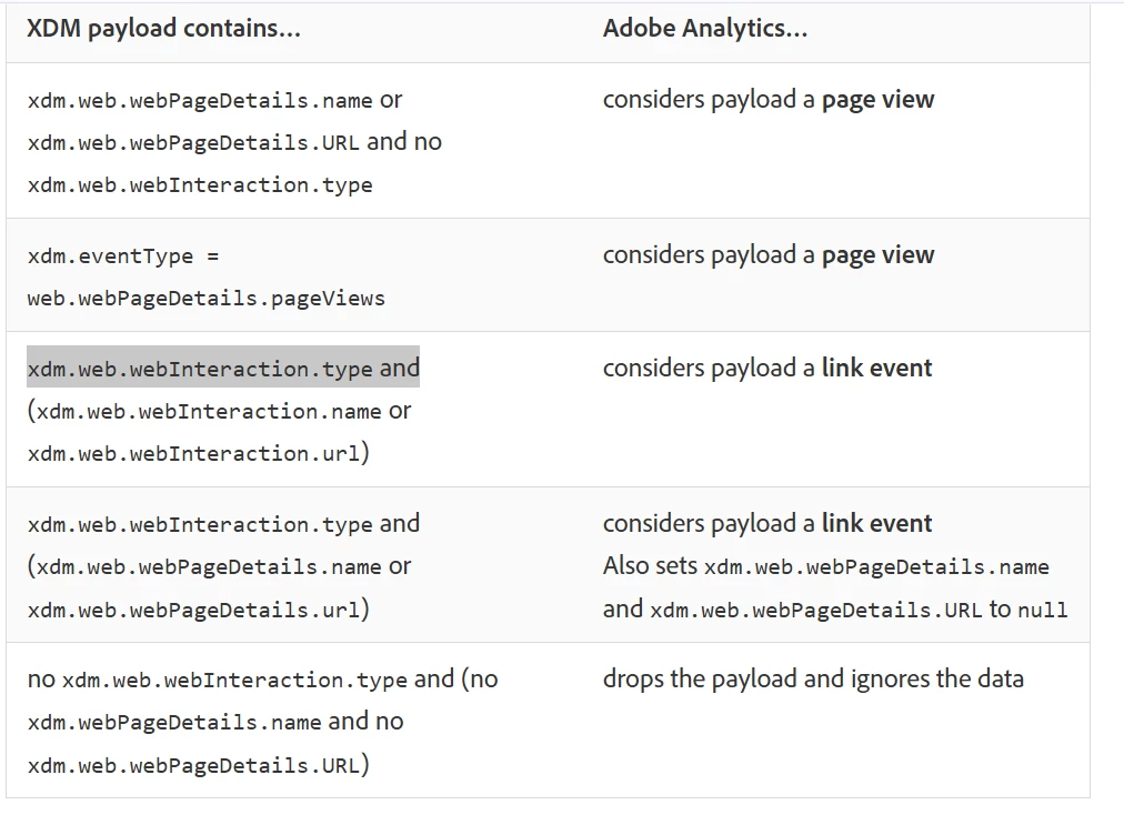
In Adobe Analytics, they really don't distinguish "page view" from "screen view"... the verbiage is shared for web and apps.
Your App data should look just like your Web data, with a few differences.
For one, your mobile app should be setting an "App ID" (something that doesn't exist on your website).
In our implementation, I use dimensions to help give context to the traffic..
- Responsive Breakpoint - in this I track the breakpoint experience... so on web, I will track the "desktop", "tablet", "mobile" breakpoints, then I added "app|mobile" and "app|tablet" into our apps
- Site Type - for context, we have a lot of subdomains that support extended content... so I track values like "core", "obituaries", "classifieds", etc, for our apps, I use "app"
I make sure that ALL dimensions match the data (values / formatting / etc) between web and app, so that everything properly rolls up into the same row for reporting.
Using these, I can separate our web traffic from our mobile app (I could also use the existence of "App ID").
- Should I follow the event type recommendations for web?
Yes, I can literally take our web calls and app calls and look at them side by side, and they will match (aside from obvious data differences)
- Do I have to send an event, such as event1 to get a screenview?
Only IF you are using a custom event on web in addition to standard PV metric. As in, I would match your web as close as possible.
Now, I do realize that your app and web may have slightly different features or behaviours.... such as "swipe left and right" to get to additional content, or maybe changing dark mode, font size, etc.... these are the things that you will have to create "App Only" dimensions or actions to track.. but it shouldn't be too hard to figure out the similarities and differences and determine the best way to track those differences while joining the similarities for everything else.

