Fix chart dates when calendar starts with monday
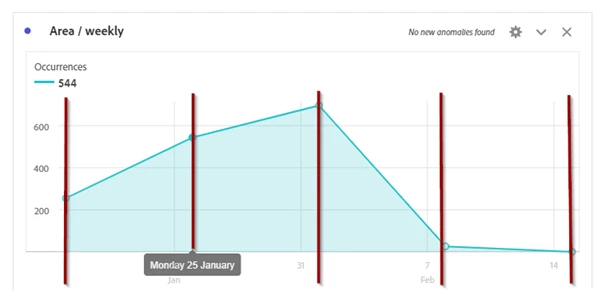
When using weekly charts the business should see the dates in the charts as they are used to .... and since our calendar starts with "Monday", I would expect that the charts also show the dates of all mondays in given time period. Here is an example of a weekly line chart to show the current issue:

as you can see, the data points perfectly match the calendar setting (showing a dot on each monday). but the dates on the x-axis are showing "Sundays", as well as the vertical lines above the x-axis-dates. so there is a "gap" between the data points and the chart description which makes it hard to read (and I think it just looks aweful ...)
IDEA: Align chart description (dates on x-axis) to match the data points
While this "works as designed" I hope this can be changed very soon - I know Adobe can do charts better than this
Thanks!

