

Easily accessible date granularity toggles for line charts in Analysis Workspace
Description -
Everybody loves a good line chart. With line charts, you can easily see numbers, but on a line! It's amazing! But I think it could be even more amazing.
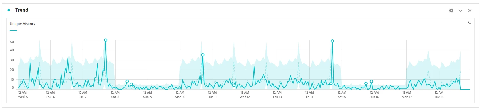
In many Analysis Workspace projects, I see some sort of line chart for top-level metrics and trends, like this one:
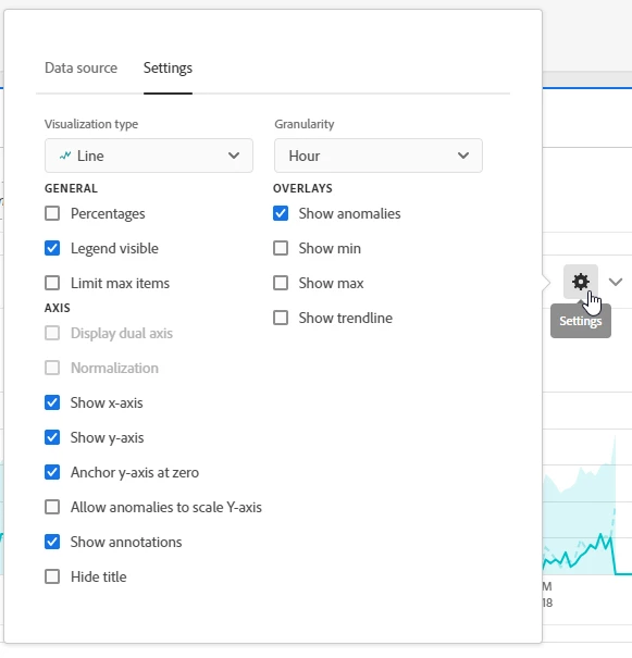
Now, depending on how our stakeholders would use this project, they might want to change the granularity of the chart to reflect longer-running campaigns, sudden traffic increases, and many more use cases. To do that, they currently have two options: Find the connected Freeform table, drag and drop a new granularity in there, and hope it doesn't go wrong OR do it directly on the chart by (finding and) clicking the little gear icon:
Now, while those methods work well enough once you a) know where to find the option and b) remember where it is hidden, we might have an opportunity here to make it just a bit easier for people to play with granularities, especially if they only use Workspace every now and then. To achieve that, I proudly propose to you: The same, but slightly different:
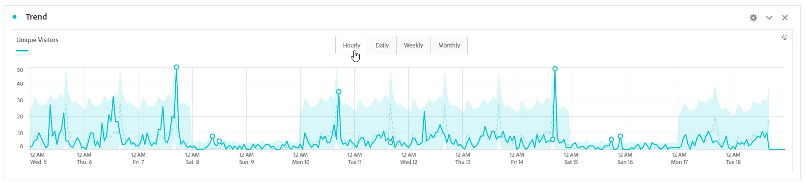
Now, we have a quickly accessible, not-scary, simple-to-understand way to change granularities without having to find the gear icon or any drag and drop. Amazing! All it needs is this little group of buttons (or, for the cool kids, a Coral.ButtonGroup) that might only show up when hovering over the chart and possibly can be hidden entirely from the gear box. And, as we all know: Fewer clicks always mean higher adoption, so this might be an easy win!
Why is this feature important to you -
Because I want my stakeholders to work with the data on their own instead of asking me time and time again how to change granularities, so I can spend more time doing what I love: Fixing GenAI errors (or whatever the much cooler analysts do these days)
How would you like the feature to work -
Like above
Current Behaviour -
Many clicks for few changes, therefore fewer changes, and more "quick 5-minute calls" with stakeholders