Change what is stacked in stacked bar graphs
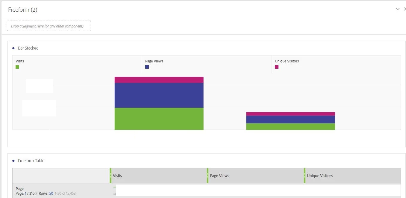
I have found that what is stacked in the stacked bar graphs is not logical. For example, with a pages report in a Freeform with several metrics, what is actually stacked is the metrics for individual pages. To me this does not really make sense - it is like adding apples and oranges in the same stack. What does make sense to me if, for example, Visit numbers for, say, the first 10 individual pages in the report are stacked - see screenshot below for current situation where different metrics are stacked for each individual pagename:
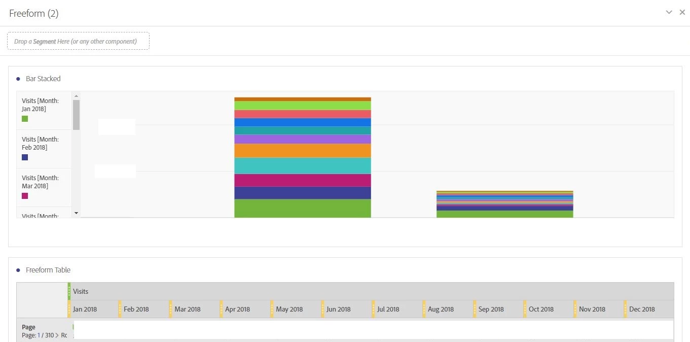
Same issue comes up in the case below where the visits metric for individual pages is broken down according to Month. In that case the stacked bar graph that I would expect would show visit numbers for different pages (like the first 10 in the report for example) stacked on each other for a specific month. So the different stacks would be for the different months. Stacking the monthly values on each other for individual pages to me does not provide insights.
So basically I suggest a pivot of the stacked bar graph report so that it produces more insights. Of course it would also be possible to offer different pivot options.