

UNFRIENDLY and MESSY Looking Workspace Text Fields
Something I do NOT like to be is a complainer, but I really don't know how to put this any other way, Adobe, and it REALLY makes me sound like I'm complaining. 😫 I REALLY HATE THAT!!!
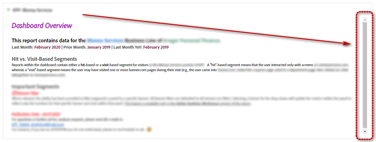
So then, how is it when I have a very neat and clean section containing all text, that a completely FUNCTIONLESS SCROLL BAR(???) still appears even though there's NOTHING TO SCROLL!! GRRRRRRRRRR!!!!!!
That means I have to make the text area LARGER than it needs to be, JUST to get rid of it. That's just WRONG and inefficient. Again. COME ON, Adobe!! Aren't you the multi-media experts?
I am going to keep shaming you until you get this stuff looking and FUNCTIONING more like it should. Perhaps like these forums pages??? HRRRMMMM????? Couldn't you just.... like.....I dunno, somehow, ....maybe - PORT..... the functionality of what I'm seeing RIGHT HERE on this very screen in FORUMS, and just USE it over in Workspace? It would make my job SOOOO much easier on those sections.
OK, rant over. I have REAL work to do now. You're killin' me, Smalls!